What is a Lead Capture Page?
by Fahad Muhammad

A lead capture page is a type of post-click landing page differentiated by an optimized lead capture form. This form allows you to collect leads for your respective offers and nurture them down your marketing funnel.
To be successful collecting leads, your capture pages need to have the right balance of “ask” and “reward.” The “ask” are the form fields you use, and the “reward” is the offer you’re promoting.
A lead capture page that asks visitors for irrelevant information to the offer is abandoned because a poorly-optimized lead capture form is one of the leading causes of post-click landing page friction. Ideally, your form should not ask for more than basic contact information on the user’s first interaction with your company.
For example, if you’re offering a more top-of-the-marketing-funnel resource such as a free ebook or webinar; your lead capture form should have no more than three form fields. Anything more and you risk scaring them away on your first interaction. You can create a more detailed form if you’re offering something such as a free trial or a product demonstration. The length of the form also depends on how far down your customers are in your funnel.
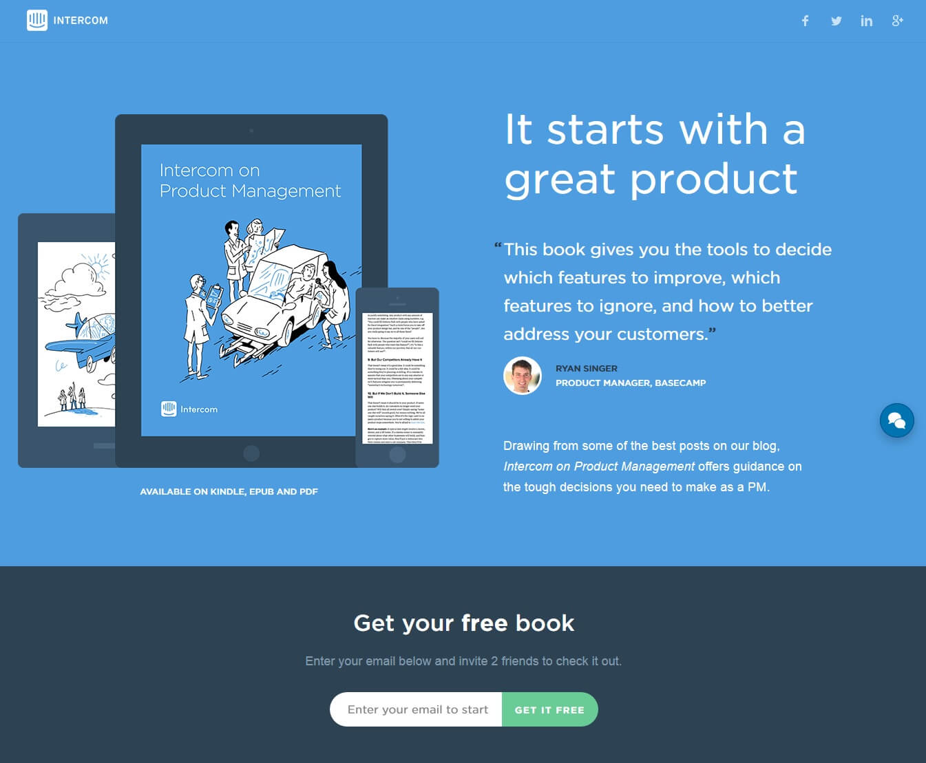
Real-world example: The Intercom lead capture page below only requests the visitor’s email address in exchange for a book — even though the post-click landing page is quite detailed. The page includes testimonials, customer badges, author introductions, and chapter breakdowns. But the page’s form length is short and sweet:
The main featured element of all lead capture pages is the form because it ultimately decides if the page will succeed or fail. However, form length is just one piece of the puzzle. To optimize your forms, you must pay attention to the following elements:
1. Form Position
Your post-click landing page’s length will help you decide where to position the form. If you have a short-form post-click landing page, the form should be placed above the fold. For long-form post-click landing pages, you have the choice of placing your form both above and below the fold.
As a general rule, offers that require more explanation or request payment should first explain the offer’s value — and then ask visitors for their information. If the value is simple to understand, the form can be placed above the fold.
2. Form Length
The number of fields doesn’t just depend on the visitor’s ease of use to complete it. Lead quality is a big factor as well.
Shorter forms typically collect more (but lower quality leads) because visitors don’t have to provide as much personal information — only name and email address, for example. Case in point, Marketing Experiments performed a case study reducing twenty lead fields to four — and saw an 188.46% increase in leads!
A longer form typically collects fewer (but higher quality leads) because visitors are willing to provide more information about themselves — such as email address, business address, geographical location, company revenue, and size.
3. Link to Privacy Policy
Alongside your form, including a “Privacy Policy” or “Terms and Conditions” link can help soothe visitors’ anxiety and encourages them to convert.
4. CTA button
The CTA button you place at the bottom of your lead capture form must fulfill some prerequisites to entice your visitors to submit their information.
To maximize conversions, the CTA button must:
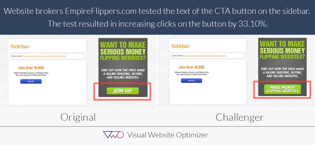
A Visual Website Optimizer A/B test demonstrated by changing the CTA button copy from “Join Us!” to “Make Money Flipping Websites”, clickthroughs increased by 33.10%:
Lead capture pages are important because they help you collect valuable information from your customers — allowing you to nurture them further down your marketing funnel.
With the help of lead capture pages, you strengthen your relationship with your target customers.
A lead capture page is one type of post-click landing page, so it is inherently different from your homepage or any other page on your website. A lead capture page is a standalone page created with the intent of promoting a single offer.
A homepage is typically created to educate your potential customers about every product you have available. Lead capture pages focus on one promotion at a time.
Featured below is Freshservice’s homepage, which is a service desk software:
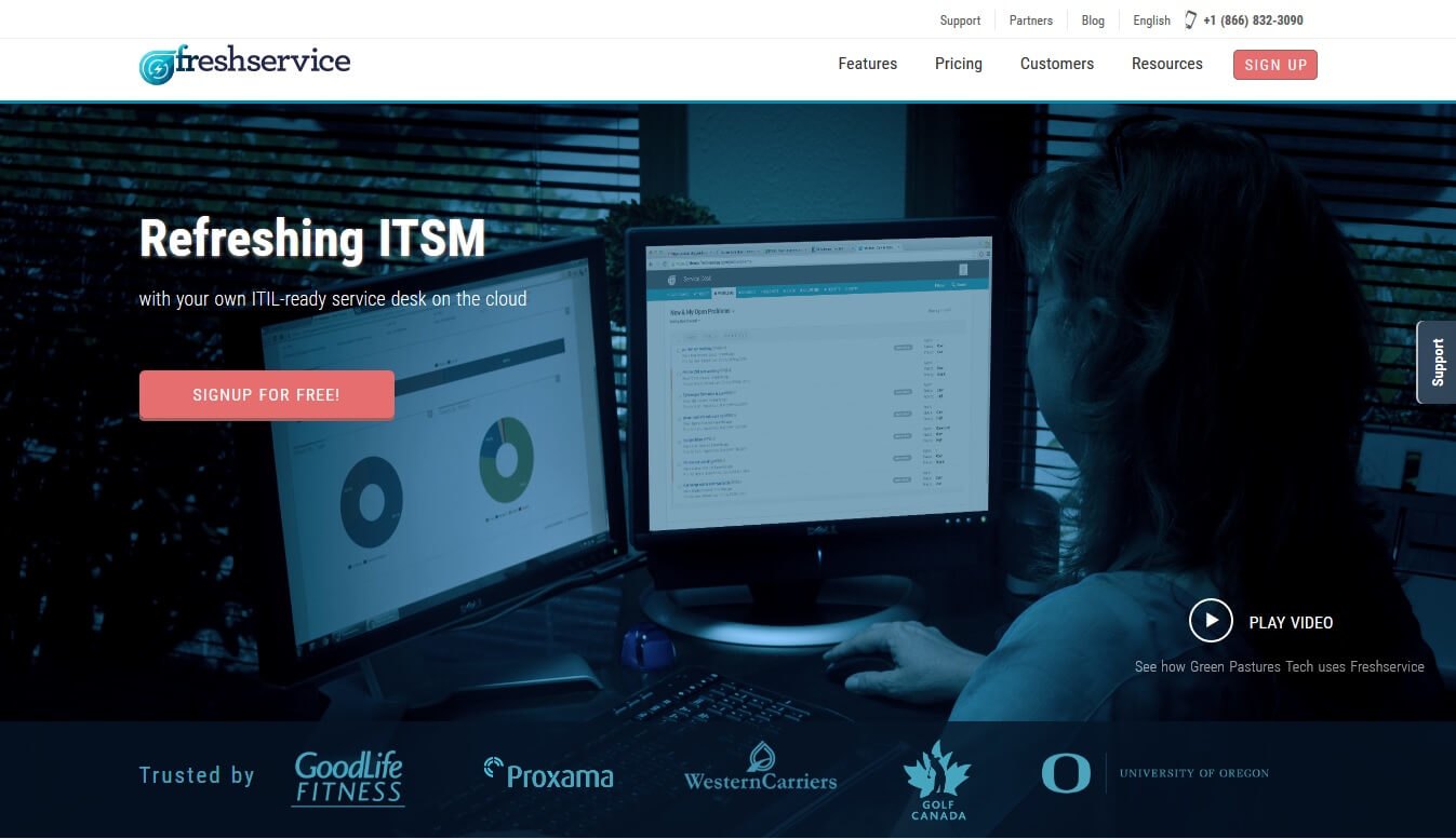
The page has:
By contrast, here is Freshservice’s lead capture page:
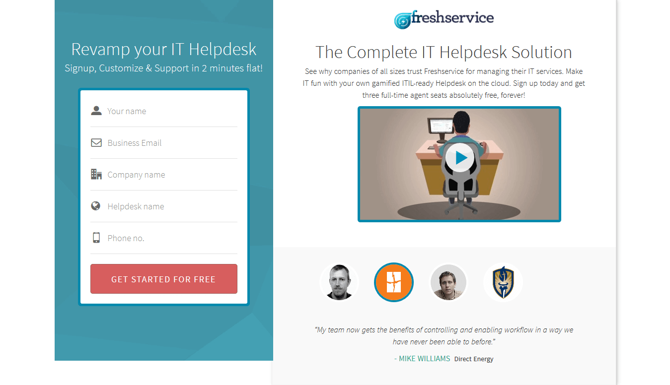
The page has:
Unlike the homepage, the lead capture page doesn’t have navigation links. The page’s main goal is to encourage visitors to sign up for the service by converting on the form.
Your product or service only has one homepage. This isn’t true for lead capture pages because you can have multiple lead capture pages for multiple offers you’re promoting.
The best lead capture pages have the following elements in place:
Attention-grabbing headline: Your headline needs to be creative and encourage readers to stay on the page. The best way to do this is to include your UVP in your headline and “message match” with your marketing campaign.
CTA button with personalized copy: The CTA button should have color contrast with your page and use verbiage such as, “Send Me the Ebook” or “Download My Checklist”.
Optimized lead capture form: The number of form fields depends on your offer and must be organized in an easy-to-convert manner.
Relevant image: Your lead capture page should also have eye-catching photography or custom graphics. If you’re promoting a webinar, include the host’s headshot. Are you promoting a SaaS free trial? Include a graphic or gif of your product.
Relevant copy: Your post-click landing page copy should explain everything about your offer. But the copy can also be a “teaser” as well — just enough to give the visitor no other choice but to convert. Also, organizing copy in a bulleted list makes it easier for people to read than blocks of copy.
Other than the five primary elements above, lead capture pages can also have the following components to boost its credibility and increase chances of lead generation.
Customer testimonials: Positive customer reviews help future customers see the value in your service.
Customer badges: Include company logos of businesses who have used your service to show potential customers how many companies you cater to currently and in the past. If some of your clients are notable companies, visitors feel reassured when they sign-up.
Trust seals: Trust seals work best for e-commerce lead capture pages as they ensure the visitors that the payment information they have entered will be kept safe. VeriSign, PayPal, and SSL logos are all examples of trust seals.
The Salesforce lead capture page has everything in place for lead generation:
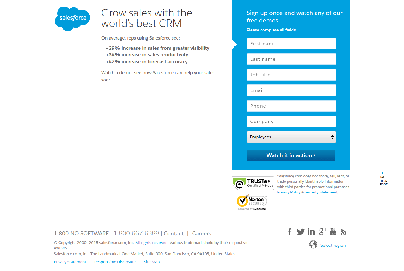
The Salesforce page offers visitors a free demo in exchange for their information. Even though it’s a short-form post-click landing page, the form is a little longer. However, because the offer has more weight than a free webinar or ebook, the page and form function well together.
The numerical proof (in a bulleted list) doesn’t just describe Salesforce’s UVP. It shows proof the service works to improve your sales and productivity. The trust indicators and CTA’s personal copy help persuade visitors to sign up.
That being said, the page lacks a relevant image.
Let’s analyze the elements that make up Shopify’s post-click landing page:
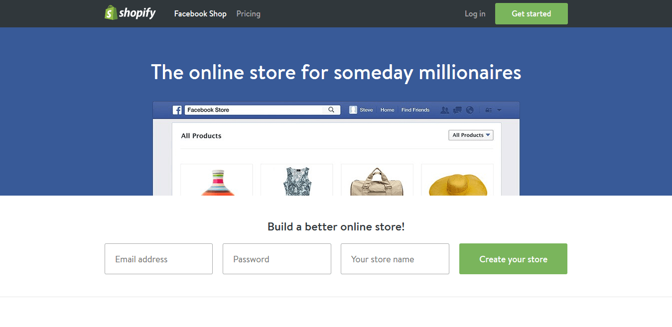
Engaging headline: The headline teases visitors by letting them know if they choose Shopify, they will become millionaires someday.
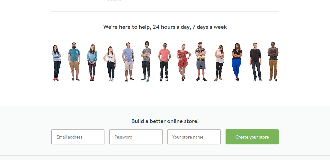
Relevant image: The images are relevant and showcase how your online Facebook store could look when you choose Shopify’s service.
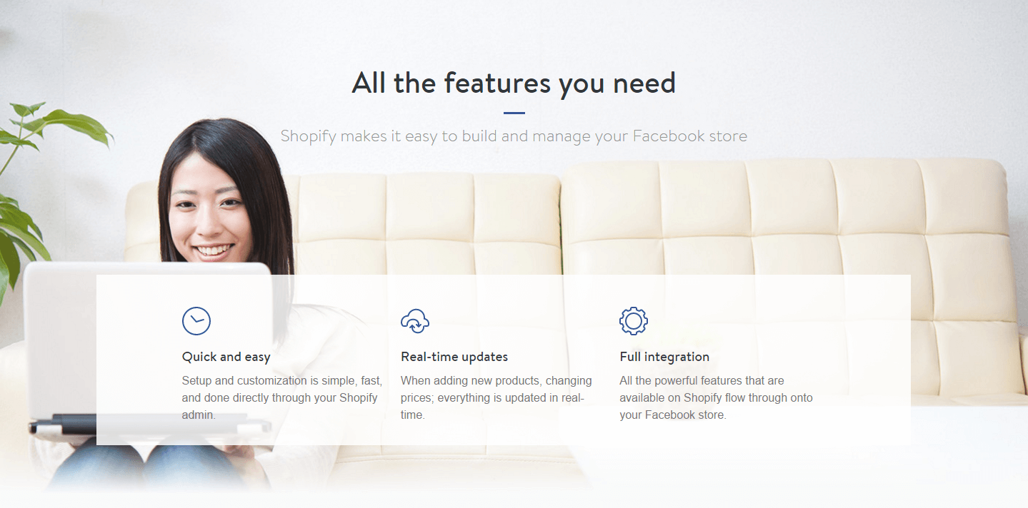
Copy explains the features: The features are explained succinctly to entice visitors into creating their online store.
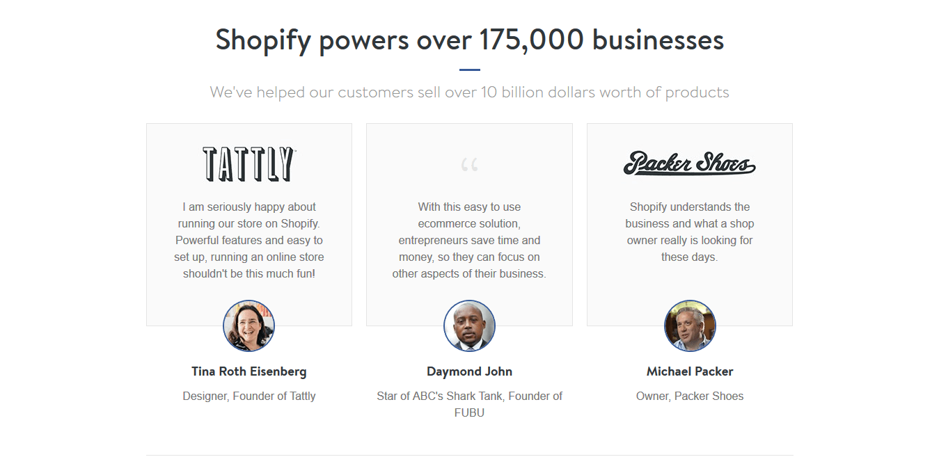
Testimonials: The page features testimonials from relevant names in the e-commerce industry such as Daymond John, founder of FUBU and star of ABC’s Shark Tank. The testimonials also include images — giving them more human appeal.
Social proof: The subheadline, “Shopify powers over 175,000 businesses,” works extremely well for social proof. Any hesitant visitor can be convinced of the efficacy of the service. Plus, when a visitor reads “we’ve helped our customers sell over 10 billion dollars worth of products” — they’re more likely to create a Shopify store.
Human appeal: To portray their amazing customer service, Shopify showcases their smiling customer support team. This way when you contact customer service, you know you’re talking to one of these representatives.
Optimized lead capture form: To create a store; a user only has to submit three fields: email address, password, and store name. The form has no friction, doesn’t ask for unnecessary information, and has a clear, contrasting CTA button.
What doesn’t work are the extensive navigation links at the bottom:
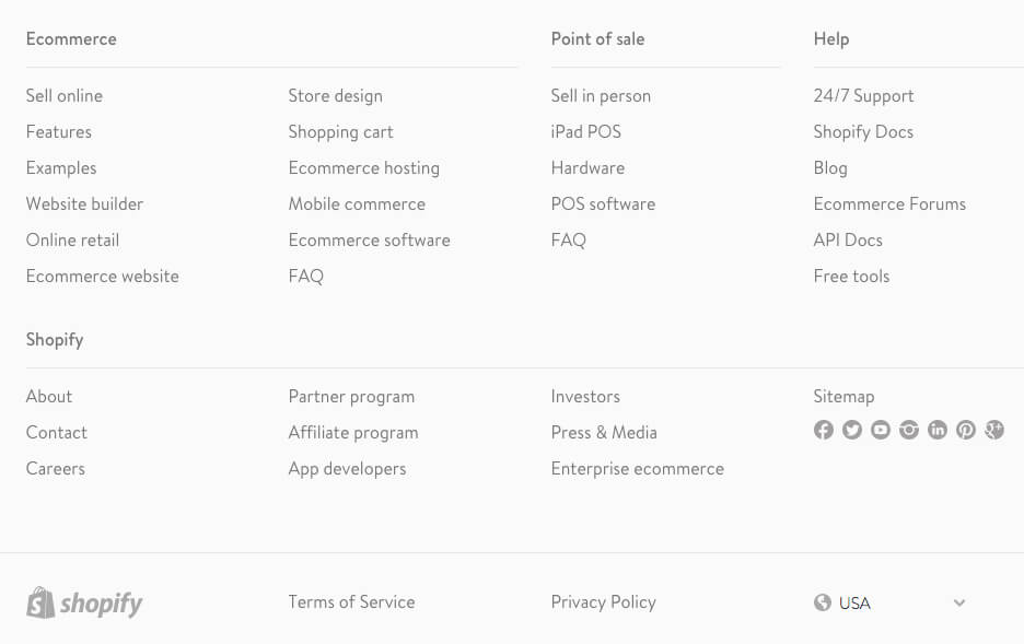
Your lead capture page is solely created to collect leads. Why risk that by giving your visitors a chance to leave before they fulfill the conversion goal?
Navigation links should be excluded on lead capture pages.
After you’ve included all the right elements on your lead capture pages, it’s now time to promote the pages to kickstart the lead capture process. As far promoting your page, you have two options:
A/B testing allows you to compare post-click landing page variations to see which version generates more conversions. With A/B testing, you can improve your lead generation based on your page’s actual data.
Because A/B testing is a viable way for you to improve your conversion rate, it’s important to A/B test all lead capture pages.
Here are some elements you can test:
Deciding how many form fields you should have is a tradeoff between the quality and quantity of leads collected from the page. A shorter form is more appealing to visitors because it doesn’t require much personal information and is quicker to complete. Shorter forms tend to convert more often, but these leads typically aren’t as high quality because you’re not requesting as much information about them (vice versa with longer forms).
In the end, A/B testing a longer versus shorter form is the best way to determine your form’s optimal length.
HubSpot’s lead capture forms include many fields, even a page that’s promoting a free ebook:

Would you be willing to fill out such a long form for this free ebook? What about a free webinar?
Before deciding on how many form fields, determine what’s more important: more leads or higher quality of leads?
Lead capture forms cause post-click landing page friction because few visitors are comfortable providing their personal information to someone they’ve just met.
A two-step opt-in process helps reduce post-click landing page friction when visitors are intimidated by your post-click landing page form. It takes visitors to a separate sign-up form (within the same tab) when they click on a CTA button. You can set up a two-step opt-in process by taking customers to a separate sign-up page after they have clicked on the button, as well.
Even though visitors are asked to do more work, you can increase conversions for two reasons. First, a daunting lead capture form can intimidate visitors. A two-step opt-in process helps because it breaks the process down, so only interested customers come to the detailed form fields, giving way to a more optimized system to earn leads.
Second, the two-step opt-in process helps reinforce their decision to convert on your form.
In the end, you can increase your leads and your visitors feel more comfortable because they can go through the page without feeling obligated to provide their information. With a two-step form, visitors will proceed to step two if they like what is being offered. Hence, they enjoy more freedom and feel better about clicking the CTA button.
Neil Patel even created a three-step checkout process for Conversion Rate Experts, which yielded a 10% increase in conversions. A two-step sign-up process will get you more conversions based on the same principle.
Instapage uses a two-step opt-in form on its weekly webinar post-click landing page. Step one shows the date and time for the next session:

Step two asks for name and email:

This is an example of a “pop-up box.” Instapage offers this feature to help reduce friction on its user’s post-click landing pages. You can learn more about pop-up boxes here.
Among the reasons most visitors dislike lead capture forms are that they have to fill them out. Pre-filled forms help increase conversions because they reduce the time visitors need to complete it to receive your offer.
Instapage’s pre-filled form feature helps make your lead capture process more efficient by remembering any user-relevant information filled out in previous forms.
As long as your field titles are the same, your leads will arrive at your Instapage post-click landing page with the work already done for them. The best part is that this works across all Instapage post-click landing pages — including other domains. So as you create more post-click landing pages, your pages get easier (and quicker) to fill out.
This is an example of how pre-filled form fields look like for Instapage’s webinar. The name and email fields were already completed when the visitor arrived at this step:

When creating a lead capture page, you have a few options. You can either:
Requesting your in-house developers create the page can put a significant burden on their time because of the necessary coding and back-end connections needed with external software like marketing automation. Plus, A/B testing pages and scaling post-click landing page production becomes infinitely more difficult with each additional page request. In addition, hiring an outside designer can be very expensive and performing A/B testing could prove to be difficult to manage.
Creating a lead capture page with a post-click landing page platform like Instapage is much more cost-effective and doesn’t require any coding or design experience. You also have total control of your page because it can be created faster with pre-optimized templates, can be integrated with other marketing applications, and A/B testing is easier to manage.
Believe it or not, you can create and publish your first lead capture page in a matter of minutes. We even offer a full range of lead capture templates to choose from:
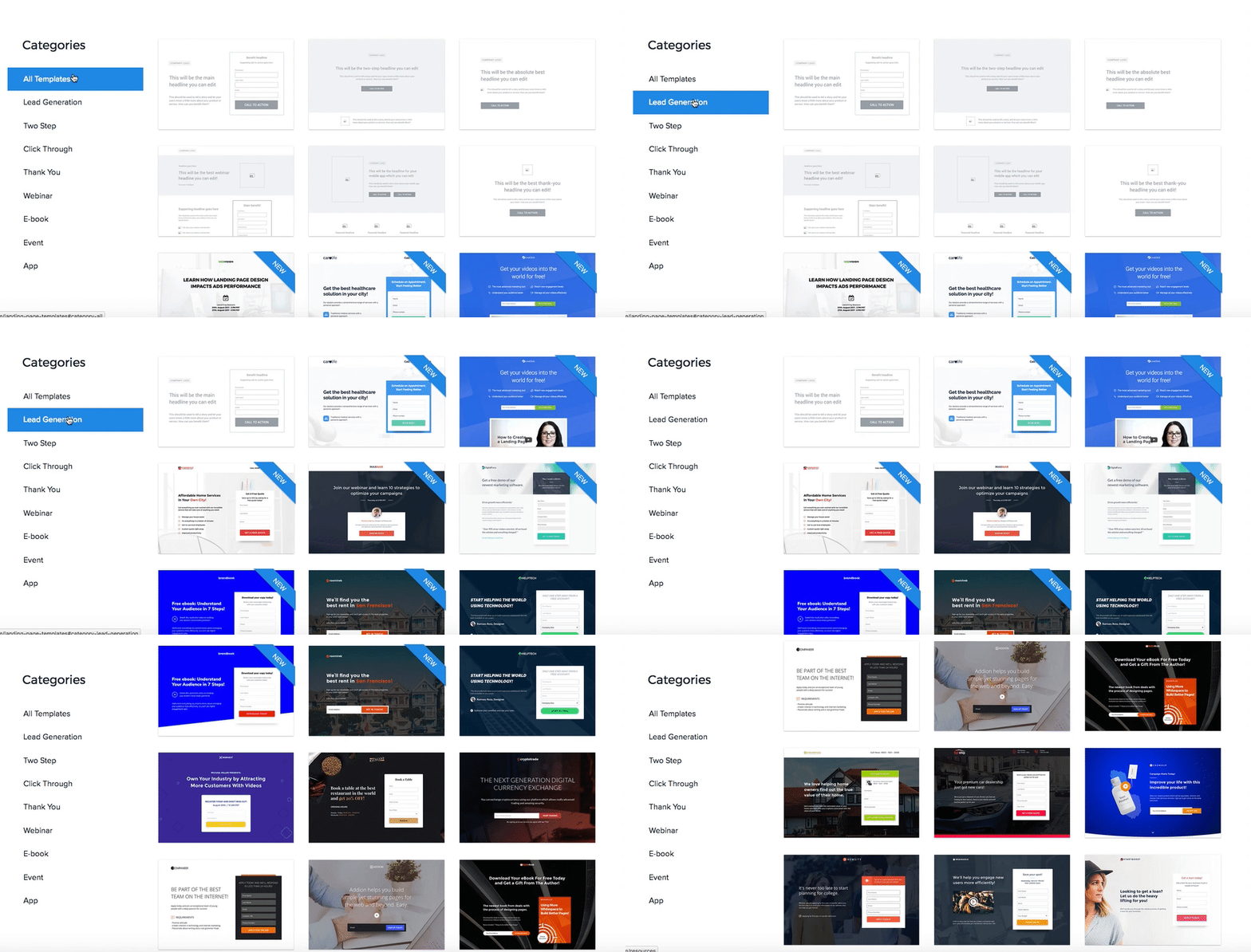
Select the template you want to edit, customize it, choose your integrations, and publish the page.
Pre-optimized post-click landing page templates are not all that Instapage has to offer. When you create your lead capture pages with Instapage, you also have the option of connecting your forms with an autoresponder of your choice. Instapage currently integrates with 20+ marketing tools and we’re always adding more.
Here’s a list of all the marketing tools Instapage integrates with:
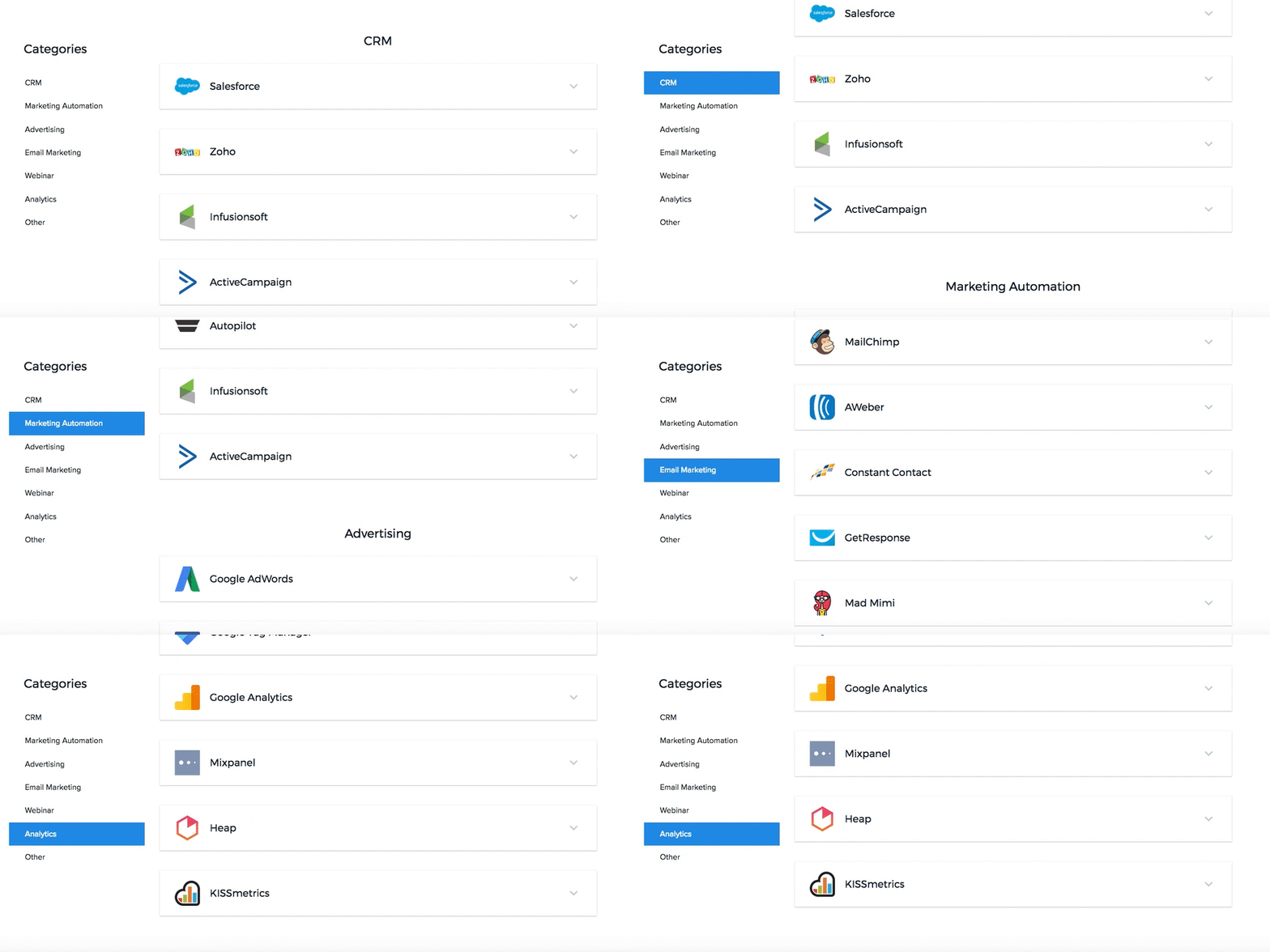
Connect your lead capture pages with the marketing tools of your choice in just a few clicks.
Lead capture pages help you collect important information about your potential customers while offering them something valuable in return. They help you quickly introduce prospects to your marketing funnel so that you can start building a better relationship with them.
Want your pages to collect more leads? Create a lead capture page, integrate it with your favorite marketing applications, and continually A/B test it to see which variations perform best!
Try the world's most advanced landing page platform today.