How can you tell if your landing page and website content are getting good engagement?
By using heat maps.
You are probably already using multiple data analysis tools and metrics to gauge how users interact with your page, and heatmaps (yes, you can write it both ways) are an important one to add to this list.
Heat maps help marketers understand what visitors are doing on their landing pages—how far they scroll, where they click, which page elements they spend more time on, and which elements they ignore. This data then helps you make optimization decisions that lead to higher page conversions.
So, let’s explore what heat maps are, how and why you should use them, and heat map tools to get you started.
What is a heatmap?
A heatmap is a two-dimensional data visualization tool where various colors are used to represent different data points. On a heatmap, colors like greens, oranges, and reds give a visual representation of different datasets, or varying hues of one color may be used to identify patterns of user behavior.
Heat maps are a form of data analysis that allow a user to immediately visualize information so you can quickly understand which data points are most important or relevant.
For instance, a landing page heatmap would immediately help you identify areas of your landing page that are being engaged with or clicked on most often based on where the website heatmap is lighting up.
Marketers count heat maps as an important tool in their marketing strategy because it gives them a way to visualize complex data versus having to analyze and digest data points found in a spreadsheet or other format.
What are heat maps used for?
Heatmaps are used in many ways by many different data analysts across industries. For example, meteorologists may use heatmaps to track rainfall in different regions of the world in order to make better predictions about weather patterns.
Political analysts and reporters famously use heatmaps on presidential election nights to track how different areas of the country are voting and predict who may be elected.
In marketing, website heatmaps are commonly used to:
- Identify click locations
- See website traffic
- Analyze sales trends
- Track sales volume
- Understand population sizes
When using a website heatmap for a landing page, a digital marketer will quickly see user engagement and where the highest value real estate is on the page. Beyond that, a heat map shows if there is any friction on a page that is causing a hindrance in the conversion process.
Conversion friction is defined as anything that creates a roadblock in the customer journey and prevents them from taking a conversion action, such as making a purchase. Friction can occur for any number of reasons like:
- Inconvenient payment options
- Lead-capture forms that are too long
- Insufficient information
- Poor UI/UX
- Ghost CTA buttons
A heat map gives you an immediate visual cue as to where on the page the friction is occurring. If the problem is a ghost CTA button, the heat map would show very little to no activity around that button, indicating that that button would need to be redesigned or moved.
Or if visitors are clicking an element that’s not clickable you’ll see a lot of concentrated color on the element, signaling to you that you need to either remove or redesign this element, or make it clickable.
A graphical representation of data like user clicks and user engagement gives marketers actionable insights that influence decisions related to page design, where different elements will perform best, and how to set up most landing pages to succeed.
4 Types of heatmaps
Heat maps encompass different tools that are used for tracking website activity. There are four commonly used types of heatmaps and each serves a different purpose and helps you focus on a specific part of your website performance.
The four types of heatmaps we’ll discuss include click tracking heatmaps, eye tracking heatmaps, scroll maps, and mouse tracking heatmaps.
Click tracking heatmaps
Click tracking heat maps show you where users click (on desktops) or tap (on mobile devices) on your web page and are usually represented by color (the brighter the color, the more clicks that link/CTA/section of your page received).
Click heatmaps are great at measuring how effective your links are and also can give you insight into areas of your landing page that visitors assume are clickable.
If you have an area receiving lots of clicks and you don’t have a link or CTA in that area, you may want to add a page element there ASAP. With click maps that provide actual visitor behavior, you can optimize your landing page to maximize results.
![]()
Eye tracking heatmaps
Eye tracking heatmaps usually provide the most accurate type of heatmap data, but are also the hardest to come by because they are pricey and not very convenient. Eye tracking heat maps quite literally observe your visitor’s eyes as they navigate your web pages.
Famously, a Nielsen Norman Group study from 2006 researched heatmap data and discovered that people tend to read websites in an F-shaped pattern. This discovery changed and shaped the way people structure their content on landing pages, knowing that there are certain areas of the page that almost guarantee eye contact.
![]()
Scroll maps
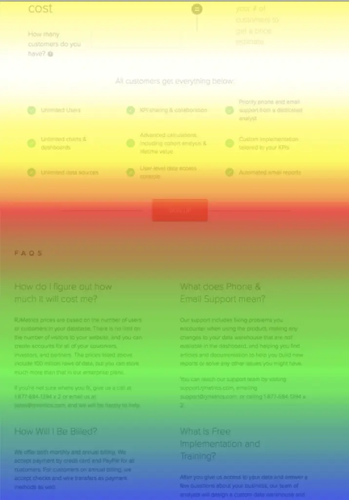
A Scroll map analyzes your visitor’s website depth, or how far down your page they are scrolling. As users scroll, their activity will be tracked. Typically, a scroll map will show the percentage of visitors who see every part of your page and is depicted with color (the more red the section, the higher the percentage of people who viewed it).
Mouse tracking heatmaps
Mouse tracking heat maps follow where visitors are moving their mouse as they navigate a page. Hot spots are usually represented in red and show where a user moved their cursor on a page.
Research has found a correlation between eye movement and mouse movement, meaning that most people move their mouse in the same direction and pattern as their eyes. If you’re only using a mouse tracking heat map without an eye tracking map, you may still have a good sense of where people are looking on your page.
Benefits of heatmaps
Marketers use heatmaps to understand user interactions on their landing pages and to gather insight on user behavior that can positively influence conversion activity.
Heat maps foster data-driven decision making and can be used to:
- Break down complex data into visual graphs
Using heat maps can save marketers time that they would otherwise be spending analyzing data and understanding the implications of that data. Instead of relying on spreadsheets and numbers, heatmaps provide visual representations of user behavior in an easily digestible and comprehensible format.
Plus, seeing user behavior on the actual landing page being analyzed helps propel design decisions without relying on designers or additional resources to mock up various scenarios.
- Improve user experience
Getting visual cues about where people are engaging with your landing page versus where little activity is happening can help you reconstruct your page and your content in a manner that matches your user’s behavior and improves user experience.
Putting the most important elements where users are already paying attention makes it highly likely that they’ll view and engage with that content and make a conversion.
- Understand your audience’s behavior
Age, demographics, gender, education, buying habits, and more all play a role in how you’ll speak to your target audience, and heatmaps can help you get even more targeted.
Understanding your audience’s behavior and scrolling preferences can help you tailor your content to them and deliver a personalized landing page that hits the mark. With audience behavior insights, you can make smart decisions about where to put a call-to-action button, how many design elements your page should have, how long your page should be, and so on.
- Make changes to your landing pages
With granular insights about your user’s interaction on your landing page, you can make data-driven decisions that are more likely to have an impact on your page’s performance.
Tracking eye movements, mouse clicks, scroll depth, and using click maps can tell you where changes to your pages should be made and increase the chances that you’ll deliver the right message that results in a conversion.
Plus, understanding your audience’s patterns can make collaborating with other departments more productive – if you have insights that will help you construct a high-performing landing page, your colleagues are likely to benefit from those insights as well.
10 heatmap tools to use
If you’re looking to incorporate a heat map tool into your tech stack, there are plenty of software options to choose from. Before you select a heatmap tool, make sure you understand your budget constraints, what kind of insights you are looking for, and how it will or will not need to integrate into your existing tech stack.
Here are 10 heat map tools to consider:
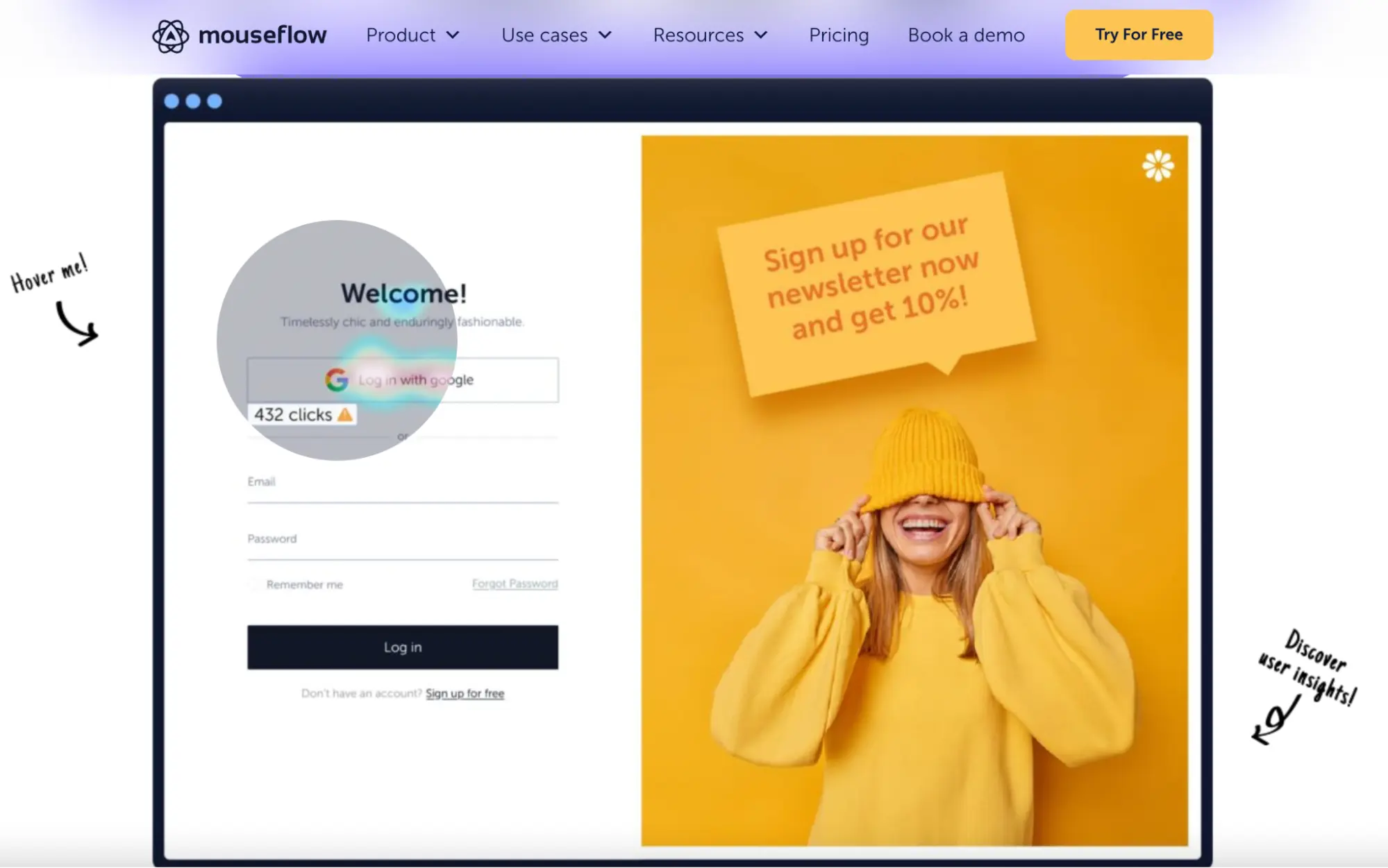
Mouseflow
Mouseflow helps marketers understand user behavior and optimize their user experience without having to manually set up heatmaps
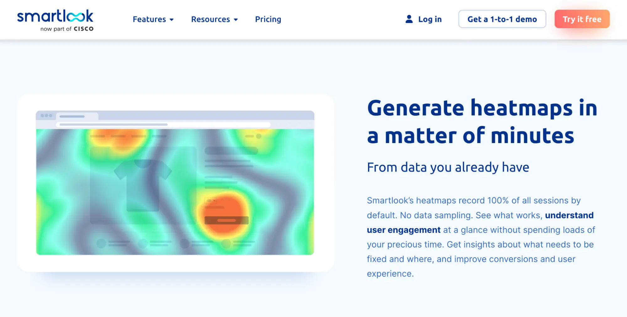
Smartlook
Smartlook delivers quantitative and qualitative data in one and provides data from 100% of user sessions
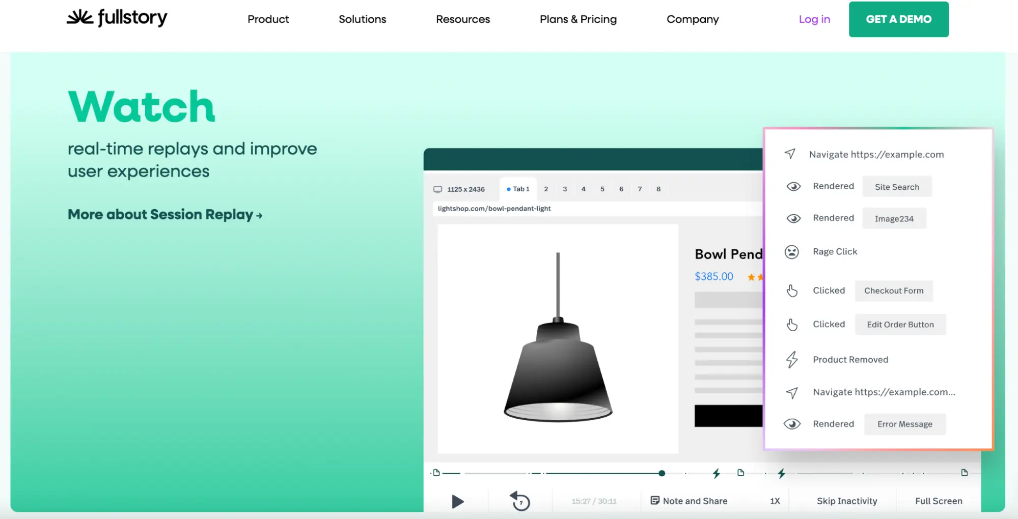
Fullstory
Fullstory lets you watch session replays so you can understand user behavior in real time and optimize the user experience
Looker
Looker is a Google product that delivers a robust business intelligence solution backed by AI, a cloud-first infrastructure, and APIs
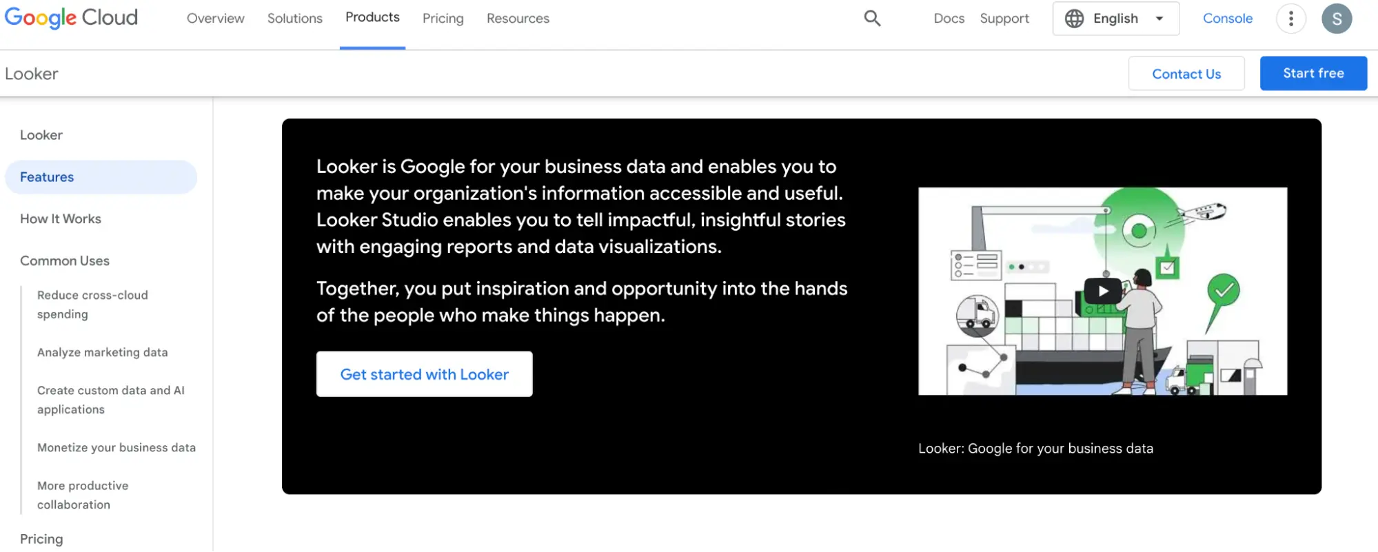
LiveSession
LiveSession helps product teams analyze user behavior to optimize UX and increase conversions
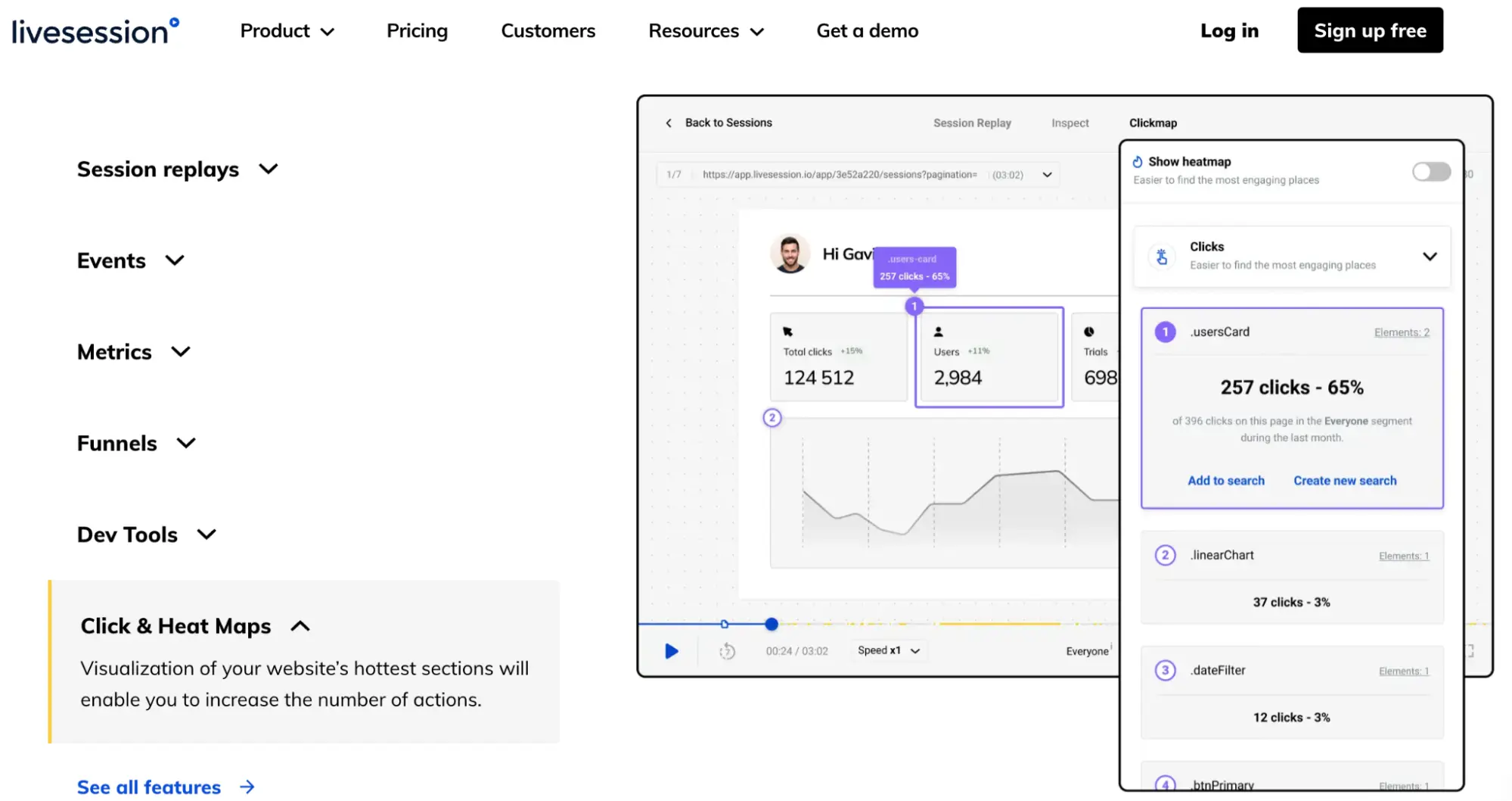
Lucky Orange
Lucky Orange provides click maps and scroll maps to help users increase conversions and integrates with many popular tools
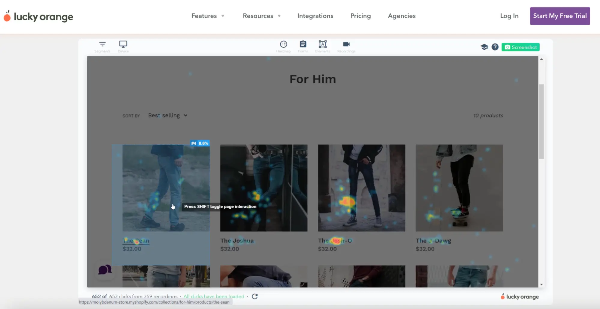
MapBusinessOnline
MapBusinessOnline is a business intelligence mapping software that allows users to manage territories, track population density, analyze different markets, and optimize logistics
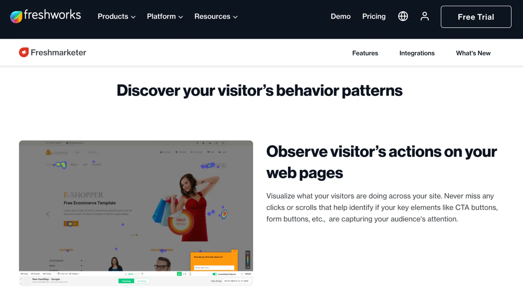
Freshmarketer
A freshworks product, Freshmarketer uses AI-powered marketing automation to deliver insights
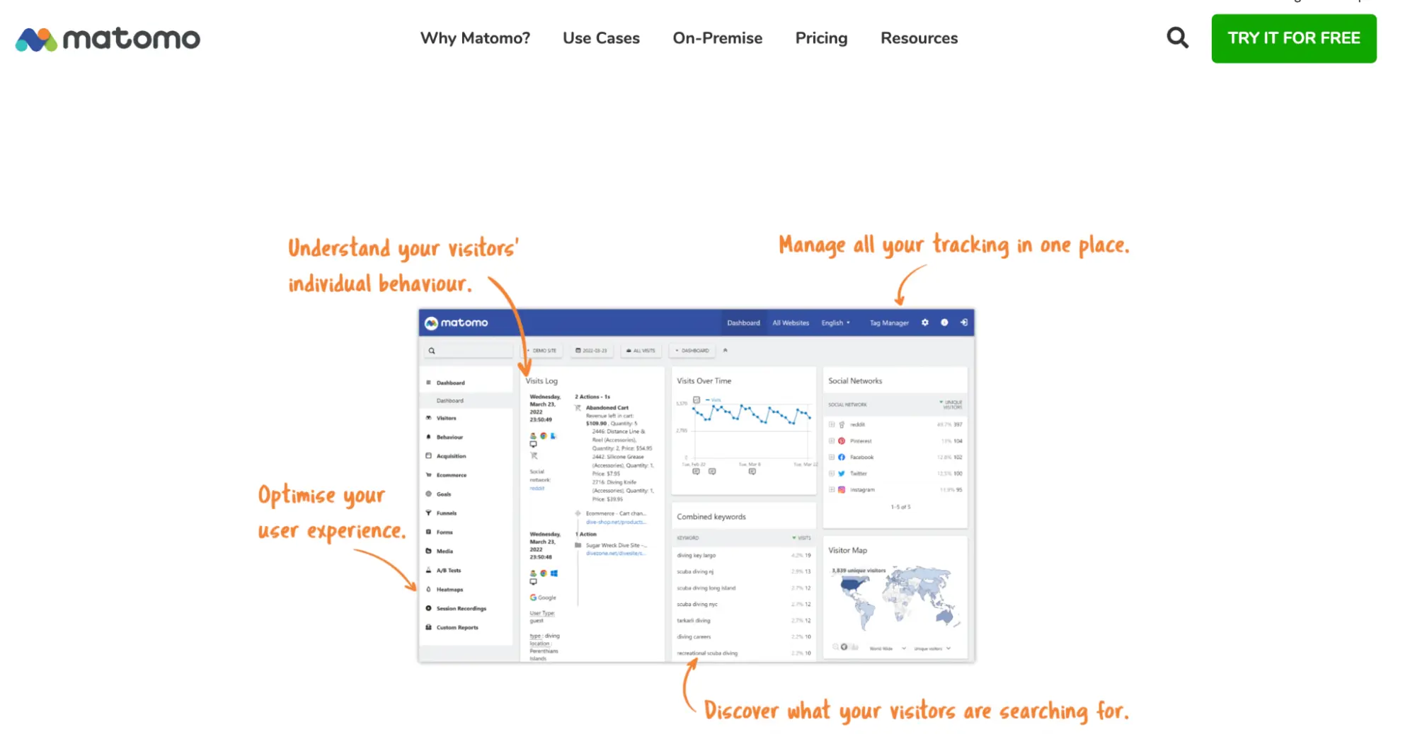
Matomo
Matomo touts itself as a Google Analytics alternative that gives users 100% ownership over their data
Instapage
Instapage is a powerful landing page solution that is built to drive conversions and delivers valuable page performance insights in one place. Instapage provides scroll depth heat maps, click maps, and mouse movement heat maps to help users understand audience behavior and optimize ad campaigns.
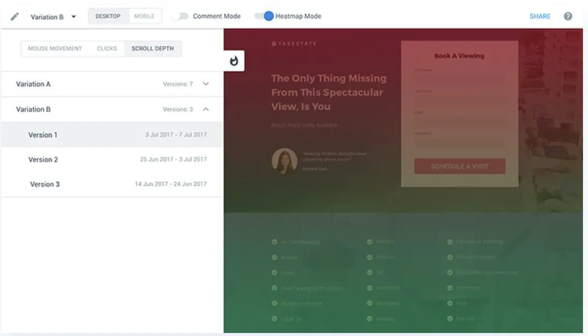
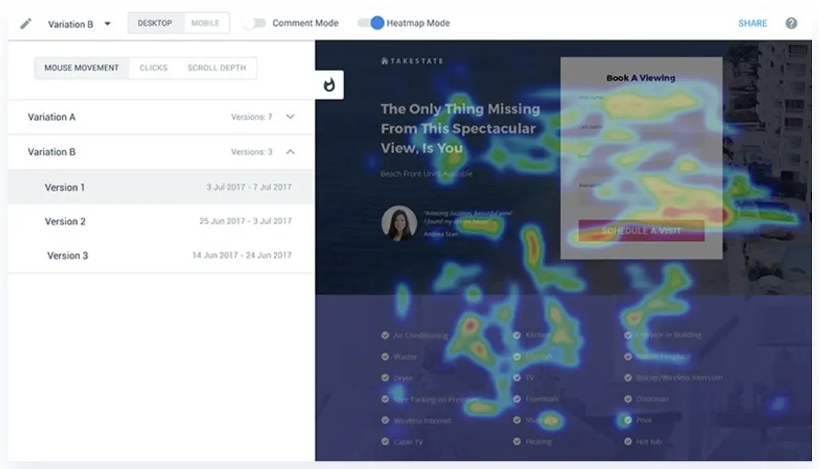
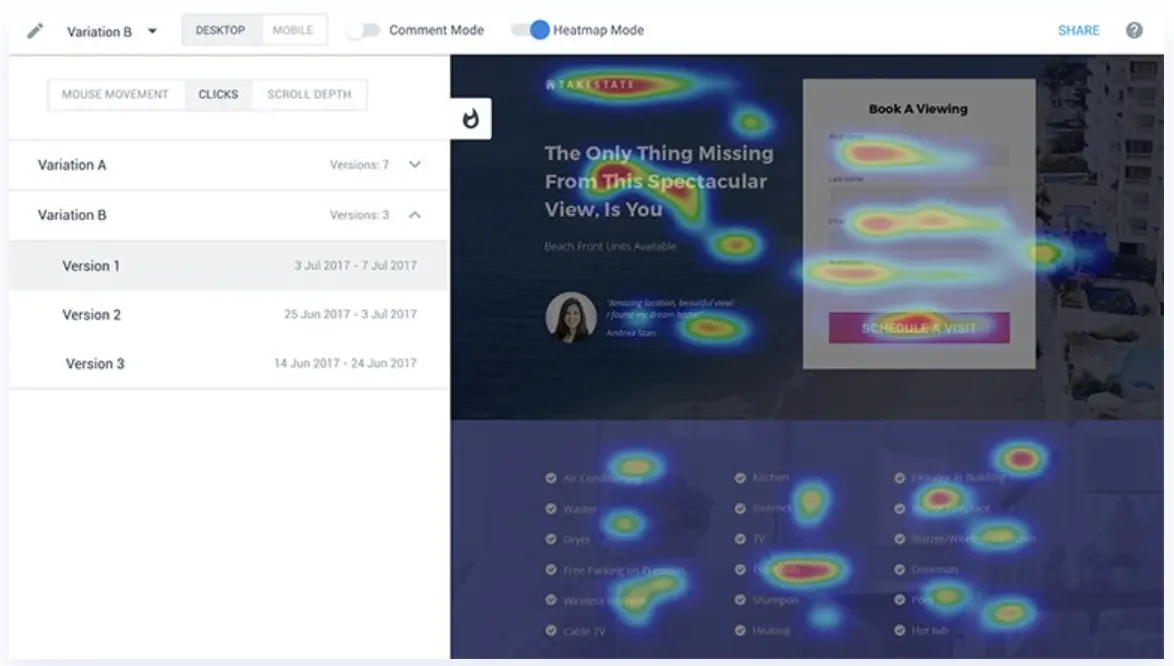
Instapage users can track audience behavior in real-time, A/B test content variations to see what performs best, use AI to help generate content variations, integrate existing tools to Instapage to make deep data-driven decisions, and easily make changes across the board with reusable templates and Global Blocks.
With 3-in-1 functionality, the idea is to understand where the majority of visitors are scrolling, what they’re clicking, and where they’re moving, so users can optimize post-click landing pages and include more elements that grab attention.
Get conversion optimized landing pages and heatmaps with one platform
If you’re looking for a way to boost your ad campaigns and drive conversions, look no further than Instapage.
The powerful landing page platform is trusted by users to turn ad clicks into customers with an easy-to-use, intuitive interface that lets you experiment, optimize, report, and scale all in one place.
Plus, with heat map technology, Instapage users can visually see where users are interacting with their landing pages and make changes to drive better and faster results.
Need a little bit more time before you commit? No problem. Sign up for an Instapage 14-day free trial today and watch the conversions roll in.
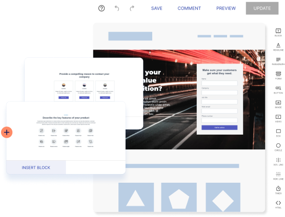
Try the world's most advanced landing page platform with a risk-free trial.
