ABOUT VIVA EVE
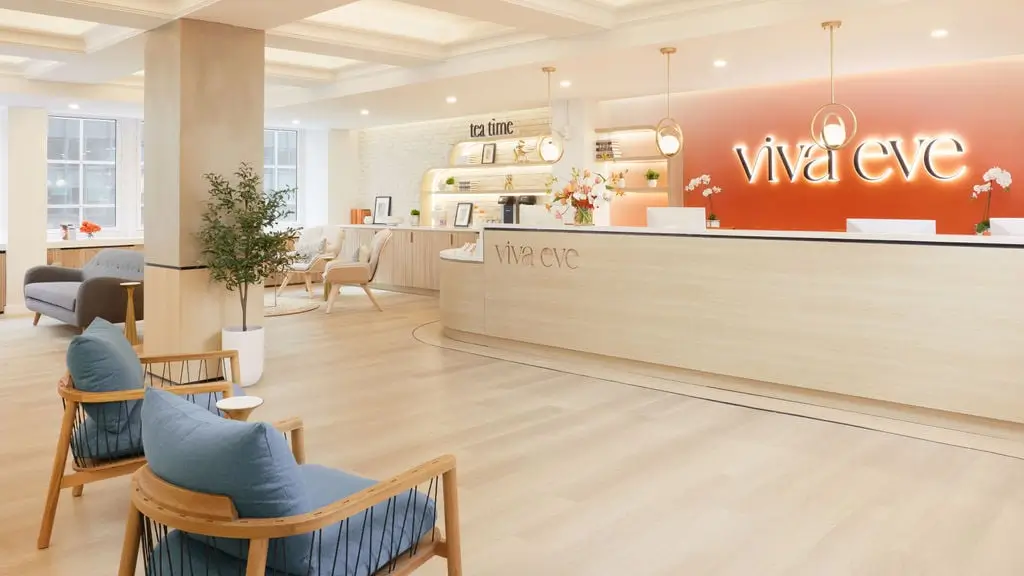
Viva Eve was born out of one simple belief: that there has to be a better way to approach women’s healthcare. The patient’s healthcare journey was fragmented, disjointed—rushed doctors, multiple visits to different specialists and offices, and a lack of education on her options were unfortunately all too common. Viva Eve built on the vision of personalized medical care, and invested in new technology and modernized processes in a commitment to continually improve medical care and treatment of their patients.
SITUATION
Viva Eve was looking for an opportunity to improve their landing page performance for social media and increase form submissions to schedule an appointment. Connecting with their Customer Support Manager at Instapage, Mia Beghetto, they launched a project to create a new optimized page template using Instapage’s conversion rate optimization (CRO), design, and engineering professional services. Once the page was launched Viva Eve saw success and wanted to build on it.

SOLUTION
Instapage provided a list of additional test ideas for two of Viva Eve’s top landing pages. One item Viva Eve selected to test was a sticky Call-to-Action (CTA) to anchor visitors back to the hero.
Featuring a sticky CTA on a landing page can significantly enhance user experience and increase conversion rates with:
- Persistent Visibility: A sticky CTA remains in view as users scroll through the page, ensuring that the primary goal is always visible and accessible without requiring users to scroll back up
- Quick Access: Users can quickly take the intended action (e.g., sign up, buy now, contact us) without having to search for the CTA, reducing friction in the conversion process
By always being visible, the sticky CTA encourages immediate action, which can lead to increased engagement and conversion rates as users are constantly reminded and nudged towards the desired goal.
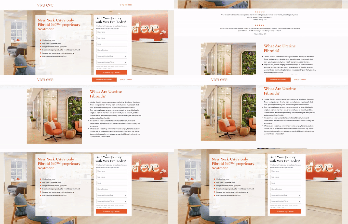
On desktop devices, a sticky header was shown with a CTA that anchored the visitor back up to the form.

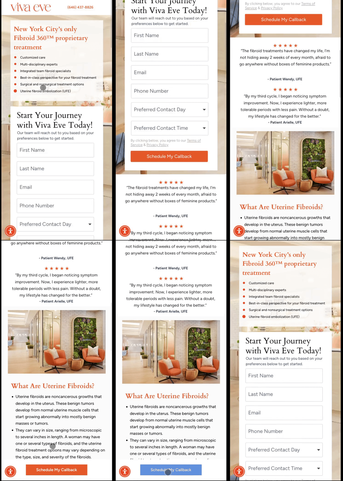
On mobile devices, a sticky footer CTA was implemented providing similar benefits as the sticky header, persistent visibility and quick access, but optimizing placement for the mobile visitor.
Our experts recommend positioning the sticky element at the bottom of the mobile screen because it provides a better user experience for mobile visitors since the button is more accessible on the portion of the screen where mobile visitors are most active (the bottom).

The Instapage team was super knowledgeable and helpful with coming up the testing ideas.
RESULT
The experiment yielded positive results and Viva Eve achieved the following outcome with the sticky header and footer implementation:
Violet Wu shared her excitement to continue testing based on the roadmap provided by Instapage’s CRO team:
The entire process was smooth and easy, with plenty of educational support provided.
In conclusion, Viva Eve’s collaboration with Instapage in implementing sticky header and footer elements resulted in a remarkable 40% lift in conversion rates. This success underscores the power of strategic experimentation and optimization in driving tangible business outcomes. With a commitment to continuous improvement and a roadmap provided by Instapage’s CRO team, Viva Eve is poised to further elevate its performance and deliver exceptional experiences to its patients.
Ready to get started?
| Learn more about Instapage: | Schedule a Demo |
| Existing convert customers: | Submit a project request today |
