As an advertiser, you know “conversions” have become a bit of a buzzword: ”more advertising conversions,” “increase conversion rate,” “optimize for conversions!” And yet this term represents very real results that are crucial for advertising campaigns and business growth.
You know conversions are valuable. But do you know what they are—and what they aren’t? What are some of the most valuable types of conversion in digital marketing—and for your brand?
We’re going to dig into the details behind the buzzword in this advertising conversion guide for digital marketers.
Advertising conversion definition
An advertising conversion refers to any action taken by a potential customer that you’ve deemed valuable to your ad campaign. Google defines a conversion as:
An action that’s counted when someone interacts with your ad (for example, clicks a text ad or views a video ad) and then takes an action that you’ve defined as valuable to your business, such as an online purchase or a call to your business from a mobile phone.
One after the other, these “conversions” lead visitors through the buyer’s journey and grow more meaningful along the way: prospects convert to leads, leads to customers, and customers to loyal advocates.
Types of advertising conversions in digital marketing
While the term “advertising conversion” refers to a goal action a visitor takes in an ad campaign, it’s very broad. There are many types of advertising conversions that can be completed by a prospect. What you aim for is largely dependent on the type of campaign you’re running and the type of landing page experience needed to convert your visitor.
Let’s run through the most common types of advertising conversion and when they’re likely to be used.
Click-through conversion rate
You’re probably familiar with click-through rates (CTR) for ads, but it’s even more important to understand what a potential customer does next.
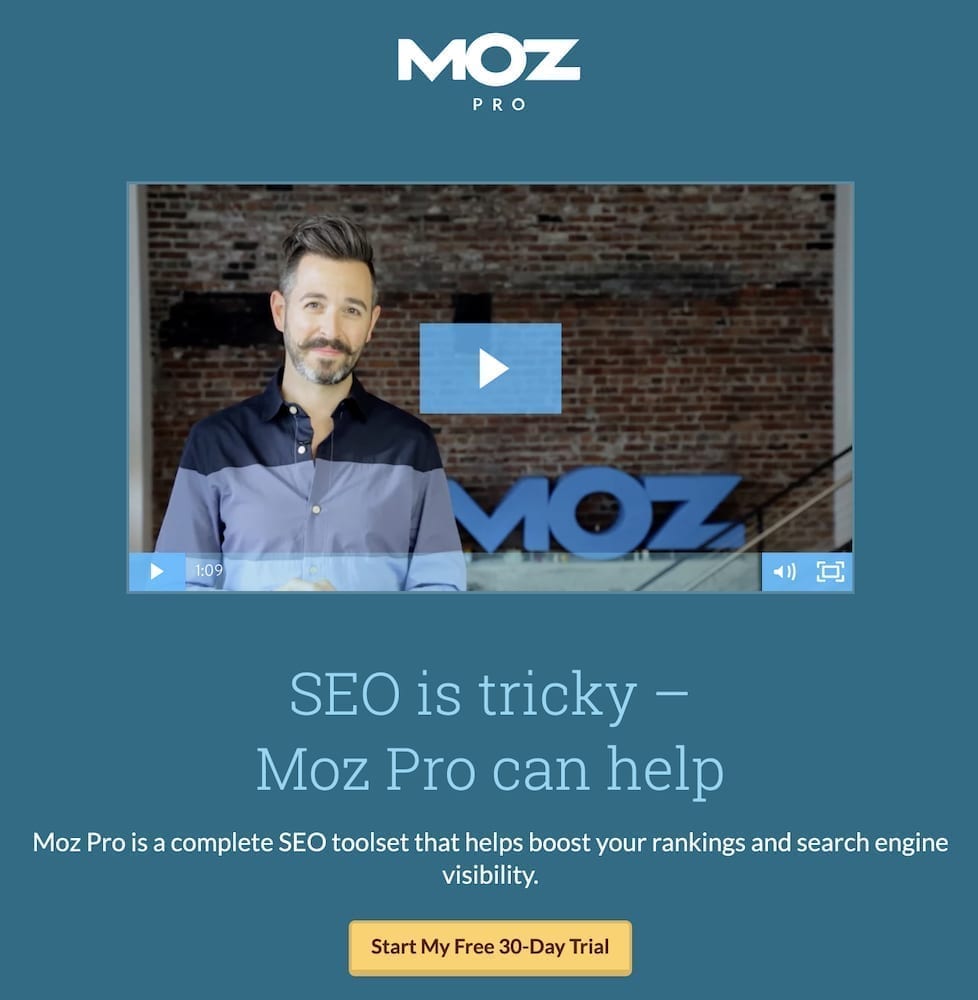
After clicking your ad, a user arrives at your landing page and evaluates your content. Responding positively to that content, they click the page CTA button. That, in turn, takes them to another landing page. Most often, this page aims to elicit a conversion with higher value, like a trial signup or a sale.
Here’s an example of a click-through page from Moz:
When to aim for the click-through conversions
Early in the buyer’s journey, transactions between prospects and businesses are very low risk. They rarely involve money: An email address is exchanged for a report, a phone number for an audit, etc. Given this, you’re not likely to see click-through pages at the top of the funnel.
At the bottom of the funnel, however, you want buyers to commit. Transactions are a higher risk. They involve money, credit card forms, commitments, payment plans, and all the other things that send buyers scrambling for the back button. That’s where a click-through page works its magic. As a goal, it’s rarely talked about because the click-through is only a means to an end. It supports sales pages, trial pages, etc., by warming prospects to the idea of parting with sensitive personal information, like a credit card number.
Landing page tools for generating a click-through
Since the click-through goal usually comes before a high-friction conversion, it should contain all of the persuasive elements you’d normally find on landing pages for other goal—but without the friction. Here are the tools you’ll need to generate a successful click-through:
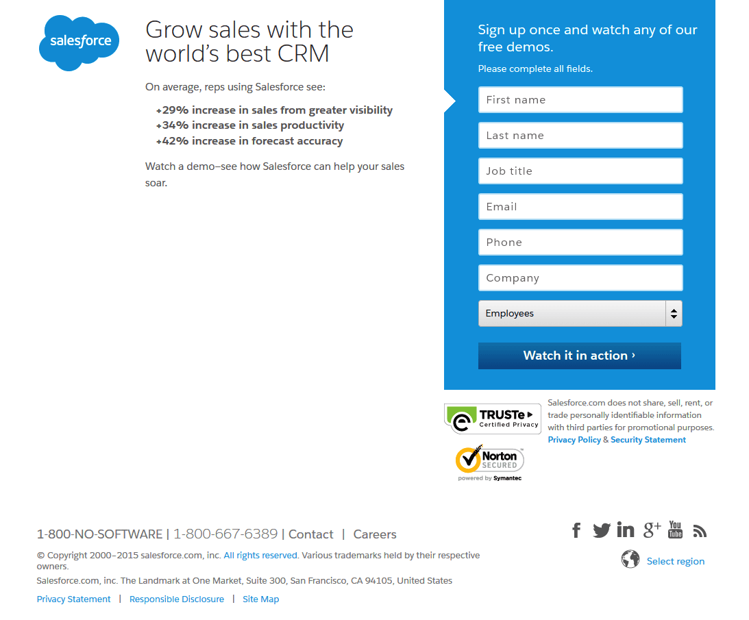
- A click-through landing page: features content like benefit-oriented copy, a magnetic headline, a 1:1 conversion ratio (meaning, not links to other pages that could distract visitors), and social proof. However, unlike most other pages, it doesn’t attempt to generate a traditional transaction in which the visitor gives something up for an offer. There is no form. There’s no request for sensitive information. That happens on the following page. The click-through page is designed strictly to emphasize the benefits of the offer.
Here’s an example from HelloFresh, showing the information visitors see above the fold.
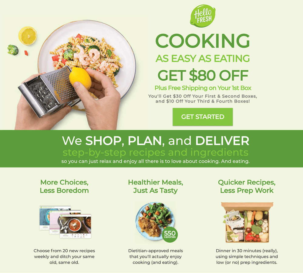
(Clicking through on the CTA goes to this page to select a HelloFresh plan.)
Even if visitors aren’t yet ready to click the CTA and make a purchase or fill out a form, click-through landing pages serve an incredibly valuable purpose: Retargeting.
- Retargeting technology: Click-through campaigns give you the unique opportunity to learn more about your prospects. With retargeting pixels implanted on your click-through page—and the sales page following it—you can create separate retargeting campaigns that speak specifically to each audience. Those who have converted on your click-through page but not on your sales page are further down the funnel than those who bounced from the click-through page. These two audiences will need different messaging to get them through the sale and eventually all the way to your thank you page.
The keys to earning click-through conversions
The whole point of generating a click-through conversion is to get visitors more comfortable with a higher value, higher friction conversion that comes after. Therefore, the key to getting it to work is to avoid the hard sell.
- Frontload your persuasive content: Don’t worry about payment details, sales terms, or credit card fields. Those can go on the sales page that follows your click-through landing page. First, you need to focus only on persuasive content: All the benefits of claiming your offer and the proof that it works such as success stories, case studies, glowing testimonials, statistics, etc. This kind of content emphasizes value while de-emphasizing the question of cost. A good click-through page will convince visitors they need the product or service, regardless of the price.
- Make page length a function of risk: A good rule of thumb for landing pages is: TThe higher the risk, the longer the page. If you’re selling an online workshop for $50, your page won’t need to be as persuasive as it would for a $500 course. The more risk involved for the prospect, the more persuasive content you’ll need to earn the conversion, and the longer that page will be as a result.
- Test extensively: While A/B testing can improve the conversion rate of pages at the top of your funnel, it’s the ones at the bottom that benefit most from the technique since they’re directly tied to revenue. A/B testing is great for determining the best overall page design and structire, while heatmaps provide additional insight into CTA placement, page length, etc. When every conversion counts, these two data collection techniques are an invaluable part of any campaign.
Leads
As an advertising conversion goal, a “lead” refers to a prospect that expresses interest in a product or service by submitting a piece of contact information in exchange for an offer. That contact information could be email, phone number, or social media profile. The offer could be a resource—like an ebook or a report—a service such as an audit, or a perk such as a discount or demo.
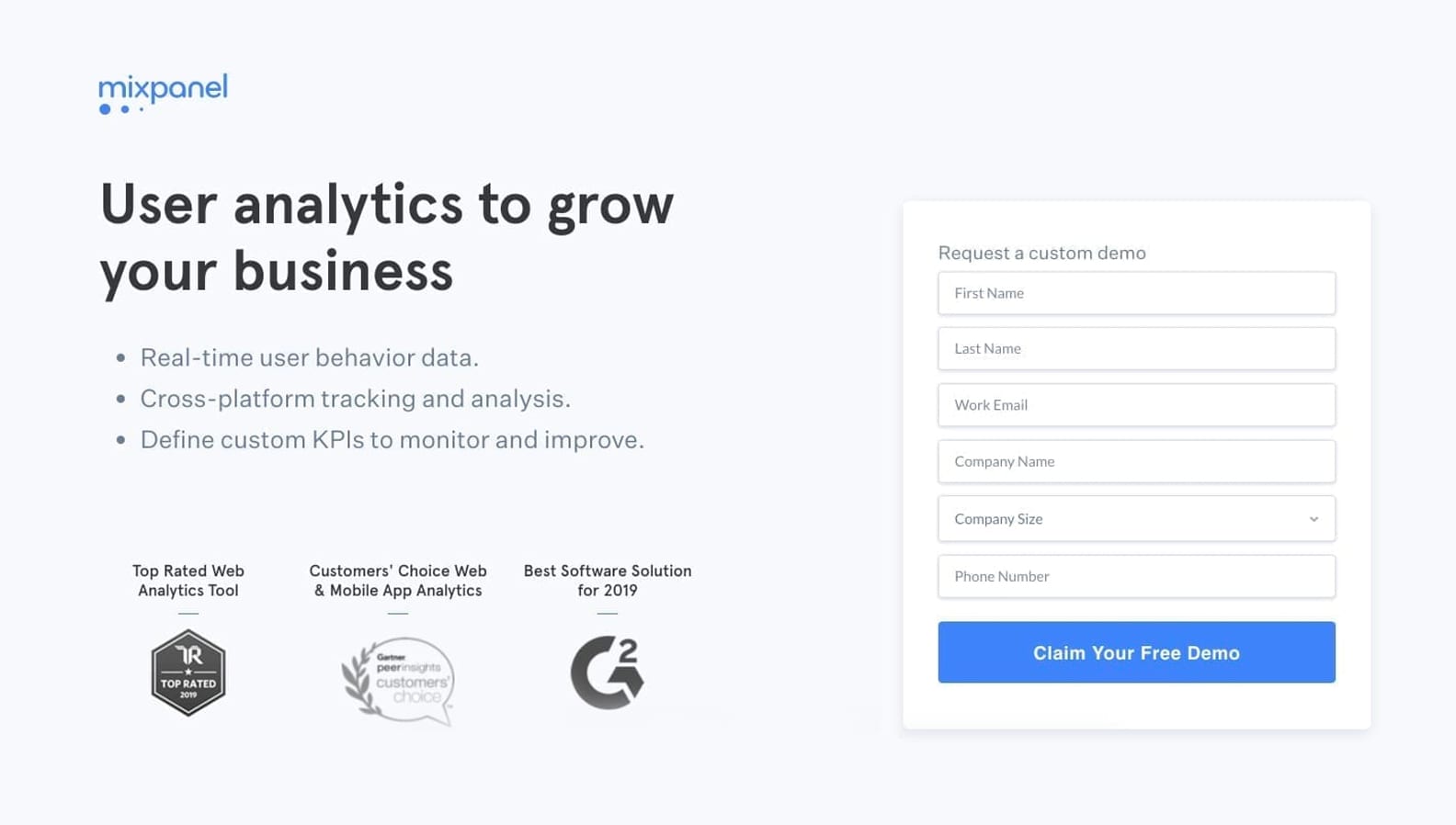
Lead generation marks the beginning of the official relationship between a prospect and a business. By exchanging their contact information for your offer, the prospect is expressing interest in your service and consenting to be contacted by your marketing team.
With this contact information, a business can begin the process of lead qualification through several channels–like social media or email, for example–collecting more and more information until the lead is deemed sales-ready
Lead generation tools
A highly successful lead generation campaign doesn’t just generate leads. It generates qualified leads that could eventually become prospects. To get the job done, you’ll want to consider the following tools.
- A squeeze page: A squeeze page is a landing page that’s designed for lead generation. Unlike most other lead capture pages, it’s designed to capture a very small amount of contact information–the minimum required to follow up with a lead.
- A super-short form: Often, the form has no more than two fields for name and email address, and many squeeze pages reduce friction by eliminating the requirement for name submission. These are highly effective at generating leads since they’re simple and don’t request much from the prospect in return for contact information.
Key to generating a lead conversion
While bottom-funnel goals are usually high-friction, top-of-funnel goals are not. That’s why the key to turning an anonymous prospect into a lead is to keep it simple.
- Be brief: Keep copy to a minimum, and use a bulleted list to highlight the benefits of claiming your offer
- Give a lot of value: Offer ebooks, tip sheets, reports, email newsletters with discounts and updates
- Ask for little in return: At the top of the funnel, when your only concern is generating a lead to begin qualification, ask for least amount of information possible—like an email
- Don’t overwhelm with media: When you’re offering a lot of value for little in return, there’s minimal risk for the prospect. You don’t need countless trust badges, explainer videos, and infographics to convince them to exchange their email for an ebook. On top-of-funnel pages, keep content minimal
Purchase/Sale conversion rate
A sales conversion is any transaction that involves the exchange of money for goods or services. The most coveted of conversions, this one occurs at the bottom of the funnel after your lead has been nurtured to the point they’re comfortable buying.
The tools for a sales conversion
More than anything, a sale requires earning the trust of a lead. And that isn’t accomplished by a singular sales page but through many relevant, quality, pre- and post-click experiences. Still, there are components that a sales-focused landing page should include.
Generally, a sales page attempts to earn a sales conversion. However, the term “sales page” is used differently by marketing professionals. Sometimes it’s used to describe a click-through page that attempts to persuade visitors to buy a product or service. While the sale isn’t completed on this page, it’s still designed to sell a product. Other marketers, however, use the term more literally to mean the specific page where a purchase happens.
To clarify…
Since we’ve differentiated a click-through page from a sales page, when we say “sales page,” we mean a page on which a sale is completed. This type of page is the one that commonly follows a click-through page. It is designed specifically to complete a sales transaction, and the main features are usually a form that captures sensitive information and some small but powerful indicators of trust and security.
What else?
HTTPS: Since this page is one on which visitors will input their sensitive information, anything other than HTTPS will likely keep users from converting. And if you’re thinking, “Nobody looks for ‘HTTPS,’” now, they don’t have to. Google Chrome, the web’s most widely used browser, will indicate to a user when they’re on a page that’s not secure:
Retargeting tech: There’s no way around it: You will have to draw several visitors back to your post-click sales page. For this, retargeting tech is a must. As mentioned before, a campaign that retargets those who clicked through to the sales page, but did not convert, will look very different from a campaign that targets people who didn’t even click through. Install it to know whether your audience will be receptive to another sales message or if they need more nurture from the marketing team.
A thank you page: While not every landing page experience needs a thank you page, a sales page does. Not only is this way to thank your lead for purchasing and welcome them as a customer, but it can also deliver value immediately with recommended content, like tutorials, that can help them get the most from their new product.
Key to generating a sale conversion
If you’ve created a great click-through page, your sales page needs only to finish the job. The work is mostly done. Still, visitors must feel comfortable inputting sensitive information and committing to a purchase. The key is emphasizing security.
Show confidence in your product: Nothing says confidence in your product like a satisfaction guarantee. These tend to make visitors more comfortable buying since they feel there’s recourse if they don’t like the product.
Take advantage of badges: HTTPS provides security, but it’s the feeling of security that gets your visitors converting. “Secure” in the address bar can do it. Still, icons from Norton Antivirus, the Better Business Bureau, or even a generic lock can sometimes be what visitors need to be sure their information is safe.
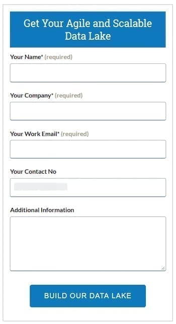
Keep your form as frictionless as possible: On your sales page, a visitor will look for any reason to second guess your brand and their purchase. That’s why it’s more important than ever to make the purchase process as frictionless as possible. Only capture what’s necessary to make the sale, and ensure all forms are clearly labeled–that the labels are permanent and outside the fields, not inside them as gray disappearing placeholder text. Error messages should be clear and concise, and a user should have no problem correcting their mistakes.
Here’s an example:
Test extensively: Like a click-through page at the bottom of the funnel, a sales page is tied directly to revenue. So, traffic willing, it should be tested extensively to improve conversion rate.
Video view conversions
A video view refers to a conversion goal in which a user views a certain amount of a video. That “certain amount” depends on the network where your video is played.
On Instagram and Facebook, a video view is counted when someone watches a video for at least three seconds. On YouTube, a 30-second instream ad must be watched for at least 11 seconds in order for a view to be counted. An instream ad on YouTube that is longer than 30 seconds must be watched for at least 30 seconds to be counted as a view.
When to aim for the video view conversion goal
To some, it’s strange to think of video view as a conversion goal since it doesn’t end in a lead or a sale. However, video views are particularly valuable at all stages of the funnel.
At the top, they’re great for introducing an unknown brand or figurehead. In the middle, they can be valuable educational content that proves your authority. At the bottom, they can prove your effectiveness through case studies and testimonials.
Videos are so versatile that there’s no particular place in the buyer’s journey where they excel more than others. However, if you’re aiming for a video views conversion, you’re likely aiming for a conversion in the pre-click experience with instream or outstream ad.
How do you achieve a video view conversion?
The key to generating a video view conversion is engagement.
Keep it short: Your video is unlikely to keep viewers’ attention for longer than two minutes. In most cases, that should be the absolute longest your video goes. One minute is better, and thirty seconds is even better than that. Pack as much value as possible into the shortest time you can—without compromising watchability.
Make it long if you need to: Sometimes, longer videos work well as introductions to relatively unknown people who have accomplished extraordinary things. If your brand relies on the image of an unknown figurehead (like an advertising course, for example), a 5- to 10-minute dive into their background and why it’s valuable can be a successful tactic.
Steal but don’t copy: Look around at other videos, read case studies, and replicate ideas from successful campaigns—but don’t create a video to look like another brand. This falls in line with the old quote from Howard Gossage on successful advertising, “Nobody reads advertising. People read what interests them, and sometimes it’s an ad.” When more interesting content is just a click away, you can’t afford to bore your visitors with the same old video approach recycled to suit your brand.
Why have advertisers not focused on conversions?
Before the internet, advertising was simple: Advertisers advertised, and sales people sold. But when businesses transitioned to digital, the way people purchased products and services completely changed. Finally, they could research and buy all on their own.
The advertising industry, though, was slow to adjust. While advertisements and web pages were often approached as separate entities by the people creating them, for the people navigating, clicking, researching, and buying, all of these assets were part of a continuous experience.
Compounding the problem was both a lack of tools early on and an old-school mentality that the new business was the best business—and if you weren’t stuffing your funnel with prospects, you weren’t advertising.
So, advertisers did what they knew best: They pumped out ads and generated traffic. The rest was up to web designers.
But to web users, the advertising campaign remained imbalanced. Product ads sent sent them to homepages where they often had to hunt for the offer they were promised. There was no consistency or trust, but there was plenty of frustration from both marketers and consumers.
Soon it became necessary to rethink the modern ad campaign.
Today, we know a campaign does not end at a click. Users expect consistency between ads and landing pages, they expect value, and they expect a level of relevance so high that we refer to it as 1:1 personalization.
With more tools than ever to help advertisers improve landing pages, that experience is finally getting closer to users’ expectations. Still, though, there’s a long way to go to meet users’ needs.
Marketers are still focused on generating leads more than keeping customers, even though we know now that it’s more profitable to keep
current customers than generate new ones. They’re on Facebook, YouTube, Google, and LinkedIn, looking for leads and sales. Judging by the following data, though, they need to be more focused on the post-click experience. Otherwise, they’ll continue to leave money on the table.
Benchmarks by industry
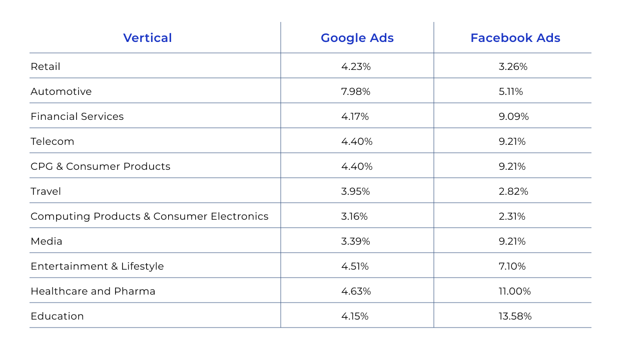
What’s a good conversion rate? What’s a low cost-per-click? How high is the average click-through rate? Chances are you’ve asked these questions regardless of your industry. And while benchmarks can only tell the story of other businesses, it’s still valuable to know what’s possible.
So, what is possible? Evaluate where your business falls based on the metrics below.
The right plan for conversion success
Now that you know what an advertising conversion is and what types of conversions you need for your business, it’s time to start creating the right kinds of landing pages to generate higher conversions with an awesome advertising conversion team
.
This is where Instapage comes in.
Find out how the #1 landing page platform for marketers can help you skyrocket conversions while decreasing your cost per click. Schedule an Instapage demo today.
