Mastering the basics of conversion rate optimization (CRO)
by Fahad Muhammad

Conversion rate optimization (CRO) is a key element of any marketing strategy. By increasing the percentage of users who “convert” it helps you maximize the return on ad spend (ROAS) your return on ad spend (ROAS). Increasing the conversion rate means generating more leads, sales, and revenue without having to increase your traffic.
But one thing that many people overlook is that conversion rate optimization isn’t a one-and-done action. To achieve long-term results optimization needs to be an ongoing process, involving continuous testing and refinement.
In order to achieve sustainable improvements in conversion rates, you’ll need to continuously monitor and analyze user behavior, test different variations of your landing pages and CTAs, and make adjustments based on the data. This means using heat maps, A/B testing, and analytics to understand how visitors interact with your landing pages and identify areas for improvement.
This guide will break down the fundamentals of conversion rate optimization and get you on your way to increasing conversions and your overall digital marketing ROAS.
Conversion rate optimization refers to the process of optimizing your website or landing pages to increase the percentage of visitors who take a desired action.
This desired action could be anything from making a purchase to filling out a contact form or subscribing to a newsletter. By optimizing your website for conversions, you can maximize the return on ad spend (ROAS) from your digital marketing efforts and improve the bottom line for your business.
The conversion rate formula is a simple calculation that allows you to measure the effectiveness of your conversion rate optimization efforts. The formula is:
Conversion Rate = (Number of Conversions / Number of Visitors) x 100%
For example, if you had 1000 visitors on your landing page and 50 of them made a purchase, your conversion rate would be:
(50 / 1000) x 100% = 5%
This means that 5% of your landing page visitors made a purchase.
Conversions can take many different forms depending on your business and your goals. Here are some examples of different types of conversions:
When it comes to conversion rate optimization, it’s important to distinguish between macro and micro conversions and their role in your overall CRO strategy.
A macro conversion refers to the primary or ultimate goal of a website or marketing campaign — these are the high-value conversions brands want their website visitors to complete. Examples of macro conversions include completing a purchase, filling out a contact form, or signing up for a subscription. Macro conversions are typically the ultimate goal for the website, representing the most significant value to the business.
Micro conversions, on the other hand, are smaller, lower-value conversions that can lead to macro conversions over time. Examples of micro conversions include adding a product to a cart, signing up for a newsletter, or creating an account. While micro conversions may not directly generate revenue, they can help move visitors down the sales funnel and increase the likelihood of a future macro conversion.
Both macro and micro conversions are important to track and optimize to improve the overall success of your campaign. For micro conversions, you can create a more compelling user experience and increase the likelihood that visitors will ultimately take the desired action.
Now that we’ve covered what a conversion is and the different types of conversions, let’s dive into what your conversion funnel should look like and how to get visitors through the funnel and convert for your offer.
The conversion funnel, also known as the sales funnel, is a model that describes the stages a potential customer goes through on their journey toward making a purchase. The conversion funnel stages may vary depending on the business and the industry but typically include the following:
The conversion funnel helps businesses understand the customer journey and identify areas where they can optimize their marketing and sales efforts to increase conversions at each stage of the funnel.
Your landing page is one of the most important elements of your conversion funnel. Connecting your search, display, and social media ads to dedicated landing pages instead of busy homepages helps you smoothly transition prospects through your conversion funnel.
Both landing pages and homepages are important for conversion, but they serve different purposes and have different characteristics.
The home page is the main page of a website that serves as a gateway to other pages on the site. It typically provides an overview of the business or organization and includes links to different site sections, such as products or services, about us, and contact information. A home page is designed to provide a broad introduction to the business or organization and is often used as a starting point for visitors to explore the site further.
A landing page is a standalone web page that is designed to encourage a specific action, such as filling out a form or making a purchase. It is usually created as part of a marketing campaign and is optimized for a specific audience and offer. A landing page is designed to be focused and targeted, with a clear call to action and minimal distractions. It may have no navigation menu or links to other pages, as the goal is to keep visitors focused on the desired action.
Now that we’ve covered the basics of conversion rate optimization, and the differences between a landing page and home page—let’s take a closer look at how to optimize your landing pages for conversions.
It’s important to recognize that CRO is about more than tweaking small elements like button color or font size. While these details can help incrementally, the success of a CRO strategy ultimately comes down to the overall user experience and ensuring that the landing page is designed to meet the needs and expectations of your target audience.
The single most important factor in a successful CRO strategy is understanding your target audience. Without a clear understanding of who your audience is, what their needs and pain points are, and what motivates them to take action, it’s nearly impossible to create a landing page that resonates with them and persuades them to convert.
You can’t effectively optimize your landing page to convert visitors if you don’t know who you’re speaking to. So your CRO strategy really begins with market research to identify your target audience. Ideally this should include both quantitative data (like demographics and online behavior) and qualitative data (like interviews or surveys) to gain a more nuanced understanding of your audience.
Once you have this information, the next step is to develop buyer personas that capture the key characteristics, motivations, and behaviors, such as this example from Buyer Persona Institute:

From there you have the insight you need to start tailoring your landing pages to their specific needs and preferences and testing them to see which headlines, images, or CTAs resonate most with your audience.
This example from Rice Business school is targeted to a specific audience segment: senior leaders looking for executive education to support their transition into management roles.

In addition to a targeted, audience-centric strategy, the best performing landing pages and websites have several things in common that contribute to their conversion rate success. These are tactics and best practices that contribute to an improved user experience, which in turn helps increase conversions.




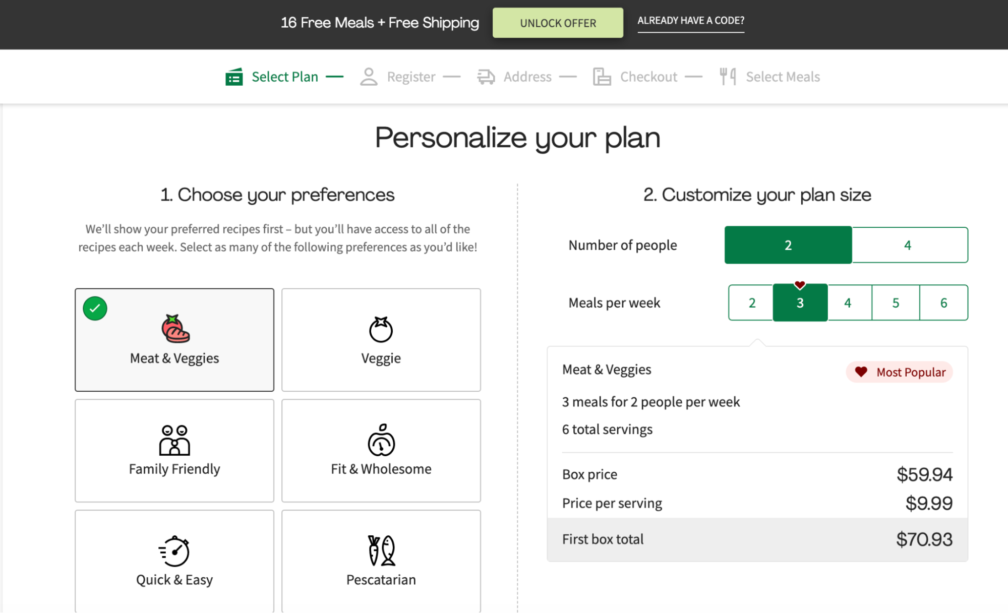
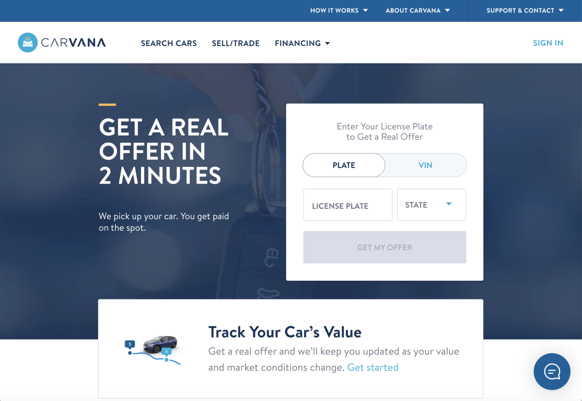


Conversion rate optimization benchmarks can vary significantly depending on the industry, the business model, and the type of conversion being measured. One factor that contributes significantly is driving traffic to an optimized landing page. For example, Instapage customers see consistently higher conversion rates across industries.
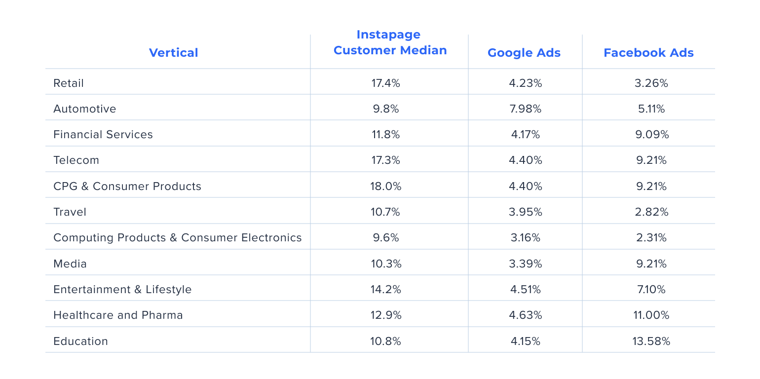
It’s important to note that these are just general benchmarks and there are a lot of variables that go into conversion rates across categories and individual businesses.
The best practice is to keep your focus on improving your own conversion rate rather than comparing your performance to industry averages. The most important thing is to continually monitor and optimize your conversion rates to maximize your return on investment.
Conversion rate optimization is a critical element of an effective digital marketing strategy. By optimizing your website and landing pages for conversions, you can increase the ROAS from your digital marketing efforts and improve the bottom line for your business.
Getting started is even easier with a partner. As conversion experts, we at Instapage are continually amassing and analyzing data that we use to determine the most effective ways marketers can improve their ROAS. We’re ready to partner with you to show you where friction points exist and how to improve customer engagement and increase conversions.
Sign up for an Instapage 14-day free trial today and our team of CRO experts will discuss how to best implement conversion rate optimization in digital marketing, set up split testing, and use the many other features of the Instapage platform to maximize your campaign results.
Try the world's most advanced landing page platform today.