Your attention span is shorter than a goldfish’s attention span.
Mine is too, according to recent research
That means if I haven’t hooked you on this article in less than 8 seconds, there’s a good chance you’re going to completely tune me out.
So you can understand why, in an age when people digest their news in 140 characters or less, most marketers follow the old saying “less is more” when it comes to written content.
But things aren’t always that clear-cut. Because sometimes, when it comes to sales pages, more is more.
Allow us to explain…
What is a long-form sales page?
A sales page is a landing page that is created for the purpose of convincing someone to buy or convert.
A long-form sales page is the same thing — except this page relies on a heavy amount of written content.
When used correctly, a long-form sales page can significantly impact conversions.
But when used incorrectly, it can overwhelm and frustrate prospects into clicking away. So it’s important to know when it’s the right tool for the job.
When do short-form sales pages perform best?
Short-form pages perform best when you don’t need to work hard to persuade your prospect to buy. That includes when:
- Prospects are highly aware of your product or brand
- Your product/service is straightforward
- Your product/service is low-cost
- Your product/service is low-risk
- Your product/service is low-commitment
For example, let’s say you’re in the market for a new toaster.
You do some online research and learn that a standard two-slice toaster is going to cost you about $35.
After searching a couple of retail sites, you’ve come up with a lot of options — but you’re not just going to pick the one that looks the prettiest. You’re going to want to do a little in-depth investigating before spending your hard-earned money, right?
You’ll likely want to know:
- The toaster’s safety rating
- How much replacement parts cost
- How fast the toaster can turn bread to toast
- The toaster’s warranty
- If the toaster had a previous owner, and how that owner treated it
Right? … No?
Of course not.
You’ll probably read a few online reviews, pick a brand name you trust, and buy the toaster without really having a second thought. And that’s because this is a low-risk, low-cost, low-commitment purchase.
Would it be odd to go through this process before buying a toaster?
Yes.
But would it be weird to do if you were, say, searching for a used car?
Absolutely not.
That’s because a car is a high-risk purchase. It’s monumentally more expensive, it needs to keep you and your passengers safe on the road, it needs to reliably get you from point “A” to point “B,” and you’re probably committing to it for at least a few years.
So, as a business owner, when you’re selling something high-risk, your product or service is under a higher level of scrutiny. The more scrutiny your product or service is under, the more you need to explain why it’s worth the price, or the commitment, or the risk.
So when you know you’re going to be highly scrutinized, think of all the potential objections your prospects may have about your product or service, and counter each one on your sales page.
That’s where long copy comes into play. Here are four times when “more is more” wins out on sales pages.
1. When your product or service comes with a big price tag
Software company Crazy Egg offers a pretty unique service.
By tracking mouse cursor movements, Crazy Egg claims they can create a heat map that will show you exactly where your prospects are looking, clicking, and scrolling on your web page.
Obviously with such a powerful service comes a high price tag. But you’d think that customers would be willing to pay the $100/month for such valuable information.
Well, that wasn’t always the case.
Initially, the $100 monthly payment was a big pain point for prospects, and when Crazy Egg co-founder Neil Patel needed help justifying the cost, he enlisted the help of an outside web optimization agency called Conversion Rate Experts.
They determined that Crazy Egg’s pricing needed some “reframing.”
After thorough research, the team at Conversion Rate Experts came up with two facts that would help them reframe Crazy Egg’s pricing.
- According to research at Carnegie Mellon, there’s an 84-88% correlation between mouse movement and the eye movement that follows.
- Formal eye tracking studies can take months, and can cost over $100,000
Armed with this information, Conversion Rate Experts was able to convince users that Crazy Egg could offer reliable data about where their prospects were looking, scrolling, and clicking. And they could do this in a fraction of the time and for thousands less than a traditional eye-tracking study.
Once they were able to justify the cost, the $100 monthly fee became much easier for prospects to swallow.
However, that wasn’t the only thing they found standing in the way of maximum conversions …
2. When your product or service is complicated
The team at Conversion Rate Experts found something else surprising during their research.
As it turns out, most of the people Crazy Egg was marketing to didn’t fully understand heat mapping – which is a pretty big problem, since that’s the service their entire business is based on.
So instead of confusing prospects further with technical jargon, they reached out to current Crazy Egg customers who understood how heat mapping worked and asked them to explain it in their own words.
Those words were then used on the redesign of the long-form sales page, along with the Carnegie Mellon research.
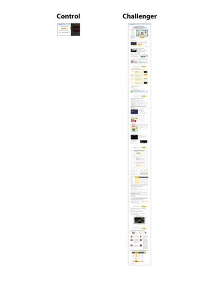
The result was a page over ten times the length of the original, and it converted 363% more prospects. Take a look here:

3. When your audience has low awareness about your product or service
Before everyone had a cell phone, people were forced to find a payphone to make a call.
Looking back, that’s very inconvenient. But at the time it was a solution to society’s lack of mobile communication.
Then, when cell phones started becoming popular, all of a sudden it became a terrible pain to locate a payphone.
This is an example of someone in the low-awareness stage.
People using payphones didn’t know that mobile communication was flawed until cell phones were introduced.
So when your product or service solves a problem that has become the status quo, you have to take extra time explaining how it works, and why it’s going to make your prospect’s lives better.
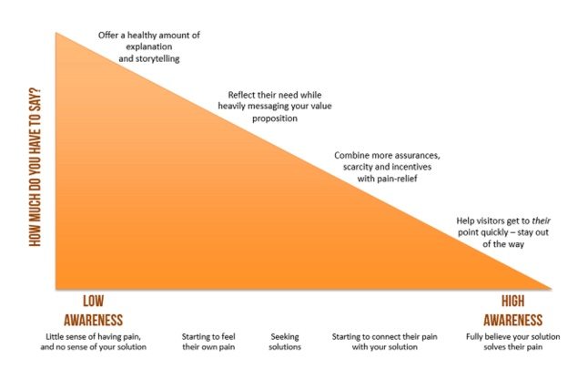
This graph from Copyhackers is a great visual aid for this point:

The fewer prospects know about:
- The problem your product or service solves
- The solution that your product/service provides
The longer and more comprehensive your sales page should be.
4. When your product or service is high-commitment
When you’re not a well-known business, and your service requires a high commitment, you have to do a little more explaining on your sales pages than most.
That’s what Highrise found out when they created a short-form landing page with the goal of getting people to sign up for the service.
However, the shorter page failed to impress visitors as it wasn’t comprehensively able to explain the service. Highrise knew they needed to turn their short-form page into a more comprehensive long-form sales page. The page would counter all of their prospects’ objections, and relieve all of their pain points.
When they did, they saw a 37.5% increase in signups with the longer page:

Remember: There’s no “right” length
Long-form sales pages don’t always work best, and short-form sales pages don’t always work best.
Generally speaking, you can expect long-form sales pages to perform better in the instances above — but there are always exceptions to the rule.
The only way to learn what works best for your product or service is to continually A/B test.
If you’re ready to create a short or long-form sales page, Sign up for an Instapage Enterprise demo today.

Try the world's most advanced landing page platform with a risk-free trial.
