My grandmother was a great storyteller.
Every night she would tuck me into bed and tell me a different story. The characters of the stories varied, there were ghosts and goblins in some, kings, queens and farm animals in others. One thing, though, always remained constant — a moral.
No matter who the hero of the story was, there was always a moral at the end — a lesson from which I was to learn something.
There was this one story about a wolf in sheep’s clothing that I particularly loved. The story was about a wolf who donned sheepskin to get what he wanted. The moral of the story was “appearances can be deceptive.” Just because you look like something doesn’t actually make you that thing.
Why am I reminiscing about my grandmother and an Aesop fable?
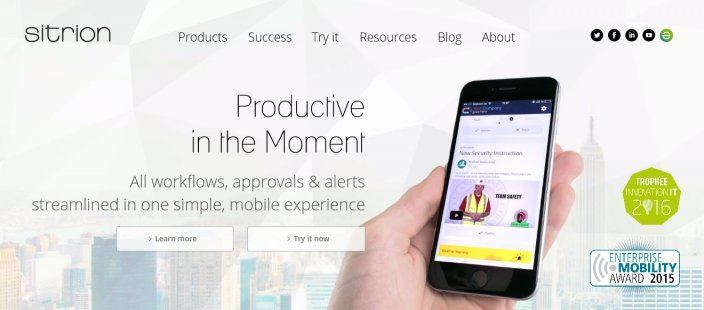
Because whenever I click on a PPC ad and come to a page like this one, I am reminded about that very same wolf strolling about wearing sheepskin:
According to Marketing Sherpa, 68% of B2B businesses use a post-click landing page platform to get leads. Sounds like a promising stat doesn’t it?
Well, not really when you compare it to this one:
“44% of clicks for B2B companies are directed to a homepage, not a post-click landing page.”
That’s right! This means when you click a PPC ad, a link in an email or a retargeting ad 44% of the times you go to a homepage posing as a post-click landing page instead of a real post-click landing page.
This is what the Sitrion page above does.
Most marketers are still unable to grasp the one thing that makes a post-click landing page a truly dedicated page and not just any other page on your website — a post-click landing page always has one goal.
What’s the difference between a homepage and post-click landing page?
post-click landing pages are standalone pages that a visitor arrives at after clicking an ad or a search result. This is the definition most marketers know and agree with, however, it’s only one-half of the full definition.
post-click landing pages focus on promoting a single offer — this is the other half of the definition overlooked by most marketers.
It’s quite simple — your homepage is created to represent your brand and all the services that come under the umbrella of this brand. So, it makes sense to promote multiple offers on your homepage, which is why having navigation links on your homepage is encouraged.
Your post-click landing page, on the other hand, is created not to represent the entirety of services you offer, it is a dedicated page that’s not connected to your website’s URL but is created to promote single offers independently. Navigation links on this page are not allowed.
Sure, you can promote your free trial on your homepage, along with an upcoming webinar and all the features your product or service provides because people coming to your website are looking for every bit of information they can find on you.
This is not the case with post-click landing pages.
A visitor that comes to a post-click landing page comes with a specific purpose in mind. Maybe he wants to register for your webinar or sign-up for the free trial. A busy homepage with lots of navigation links is only going to distract the visitor from getting what they want and derail them from accomplishing the conversion goal.
An optimized dedicated page, however, will give them the necessary information required to make the decision and complete the conversion goal.
What are navigation links?
Navigation links (or a navigation menu) is a map or a set of directions of a website that takes visitors deeper into the website experience.
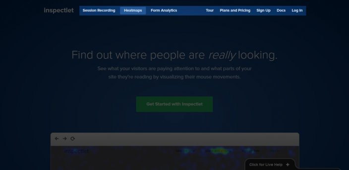
This is what a navigation menu looks like on a page header:
Here is that same page below — this time showing the footer and all of its respective links:

These links take visitors to different website pages, making it easier for them to navigate different website areas.
Every link on a navigation menu represents an individual conversion goal, and each one serves as an exit route (an excuse) for the visitor to leave a page goal and arrive on another. This is precisely why post-click landing pages are no place for including individual navigation links — or worse — a full-fledged navigation menu.
A dedicated page no longer remains dedicated if there are navigation links on it. So, if the page is connected to your PPC ads, social posts, emails, or retargeting ads (and it has navigation links), then it’s not a post-click landing page because it doesn’t stay true to the second half of the definition.
Navigation links don’t make it easy for visitors to complete the conversion goal.
When you put navigation links on “post-click landing pages” what you’re essentially doing is hurting your offers in two distinct ways. We’re going to discuss just how harmful these links are to your post-click landing page conversion rate.
1. Navigation links are a distraction, and lower post-click landing page conversion rate
Yes, your post-click landing page is a single page. It can be a long page (like in the case of a long form sales page), but it’s still one page. This is why there’s no need for navigation links because there are no other pages to explore on this single page.
When you put navigation links on a standalone page, you connect it to other pages on your website which distract visitors from the offer at hand, ultimately, lower post-click landing page conversion rate.
Let’s elaborate with an example.
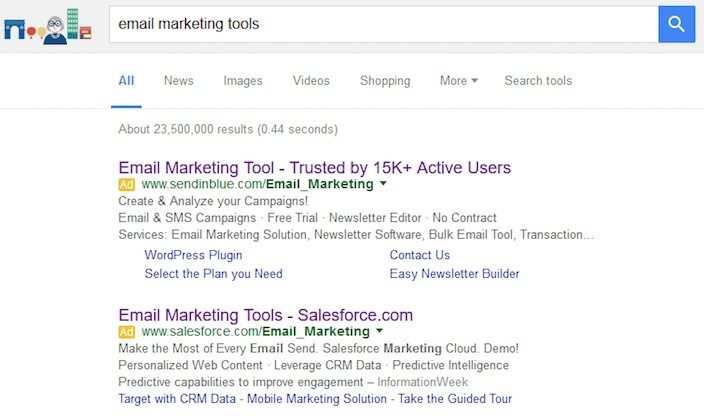
I’m looking for an email marketing tool and see the following Google ads:
I click the first search result and this is the page SendinBlue takes me to:
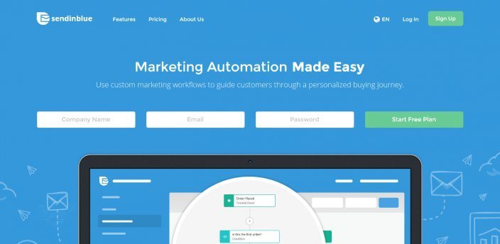
The page has an animated headline that switches between “Marketing Automation Made Easy”, “Marketing Campaigns Made Easy” and “Transactional Messaging Made Easy.” So, far so good, but, while I’m reading the headline I can’t help but notice that there are seven clickable elements present just above the headline.
I have the option to check out features, poke around the pricing page, and get to know the brand on their about us page. Every single link serves as an excuse for me to leave because I take my eye off the prize — the free plan.
This is not what a dedicated post-click landing page should do.
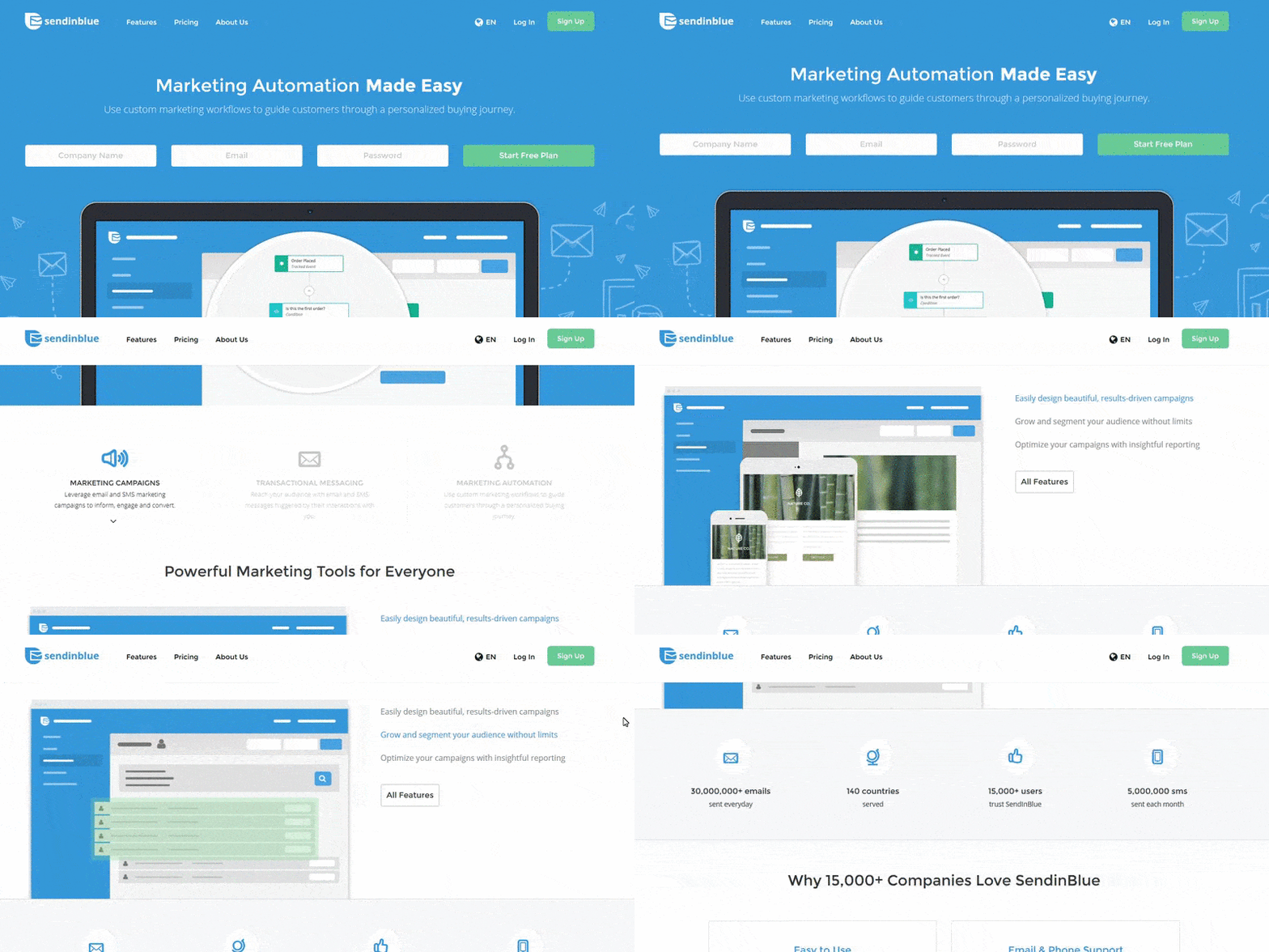
The SendinBlue page doesn’t just have a navigation menu, but it has a floating navigation menu that doesn’t let me focus on the free plan even when I’m scrolling down the page:
Disappointed from the SendinBlue page, I back-out of the page and clicked the Salesforce ad. This is the page I come to:
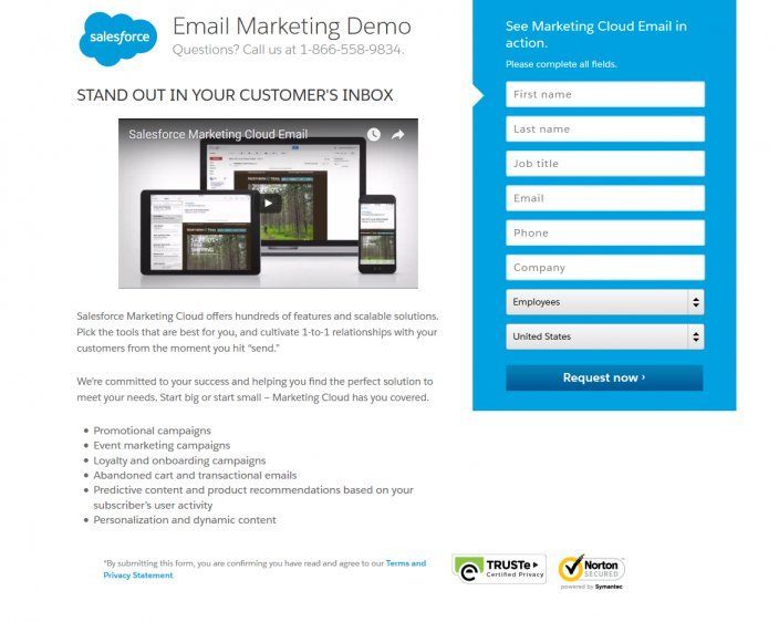
This is a much shorter page. The headline “Stand out in your customer’s’ inbox” sounds intriguing to me. The copy tells me the benefits I’ll get from the service with a video I can watch for a more in-depth look at what Salesforce does. Sure, the form is a little intimidating, but I do want to see the software in action so I’ll fill it out.
And because they’re asking for a little more of my information — they’ve placed a security seal on the page along with a link to their Terms and Privacy Statement.
However, these links don’t serve as a distraction, in fact, they are necessary for the conversion because they add credibility to the page. I didn’t see the links until I filled out the form. Plus, nobody would click the privacy statement link unless they were worried about keeping their information secure anyway.
What’s the difference between the two pages?
The Salesforce page focused on the email marketing demo offer which is what the post-click landing page was created to do. SendinBlue’s page distracted the visitor with an unnecessary navigation menu and suffered abandonment as a result.
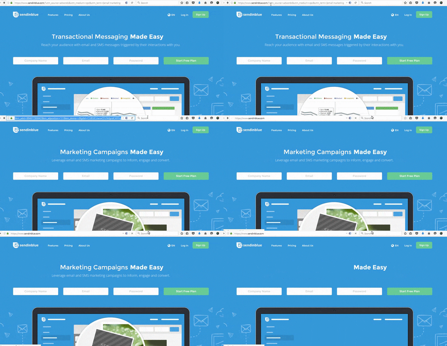
In fact, the SendinBlue page is not even a post-click landing page because when you remove the UTM parameters (tracking code) from the URL, you come to the service’s homepage (the same as the page connected to the ad):
For comparison, when you remove the UTM parameters from Salesforce’s page, look what page you go to:
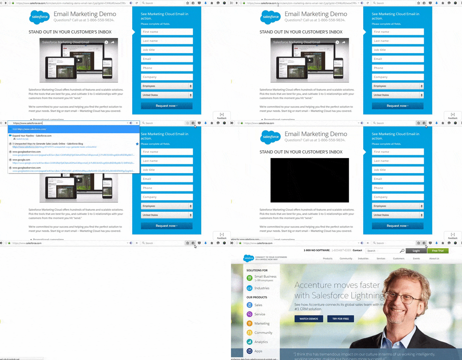
The Salesforce page is a standalone, dedicated page.
2. Navigation links cost you money
Getting your PPC ad clicked by prospects costs you money. The amount you’re charged is known as CPC (cost-per-click) or PPC (pay-per-click) and refers to the amount you pay when a visitor clicks your ad.
Keywords have different monetary values — with CPC ranging from a few pennies to over $300.
When you include a navigation menu on what was supposed to be a dedicated page, and connect that page to your PPC ads, you give people a reason to not convert on the page (essentially costing yourself money for no reason). This is because even though your visitor clicks your ad and costs you money, his chances of converting on a homepage are slim due to all the distracting exit links.
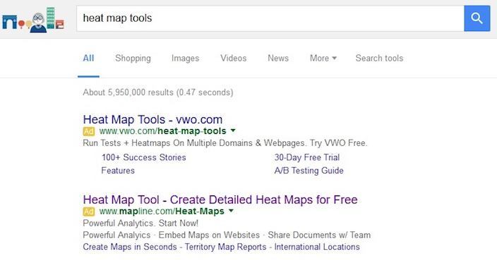
Let’s do a Google search for the term “heat map tools:”
Before I click any of the ads, let’s do a quick search and see what the CPC is for the keyword “heat map:”
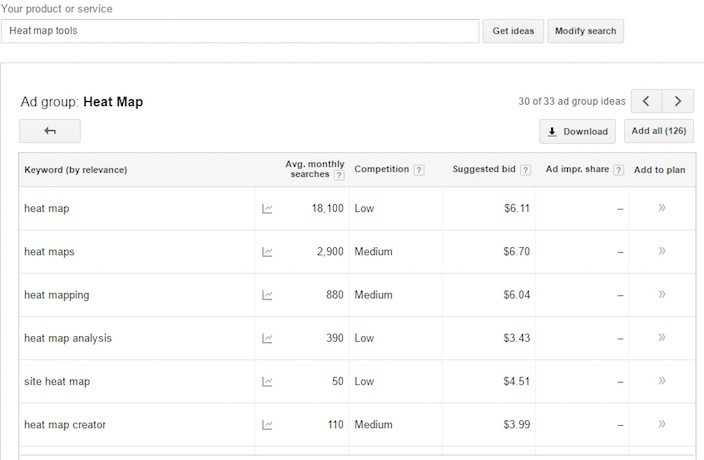
The suggested bid on the exact keyword is $6.11. That’s $6.11 out of your pocket every time a visitor clicks your ad.
The first ad takes me to the VWO post-click landing page:
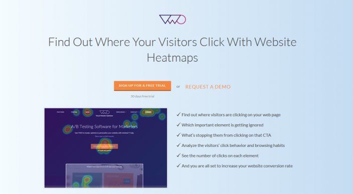
There are no navigation links on the page. All the page elements are designed to get visitors to focus on the free trial offer.
The same is not true for Mapline, which clearly takes me to their homepage:
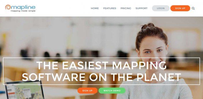
The page has a full navigation (that floats with you as scroll down the page) and a footer full of links.
Compared to VWO, I’m far less likely to convert on Mapline’s “sign up” CTA on their homepage because there are so many other distractions available to me, and as a result, I leave the page. In the end, once I clicked Mapline’s ad, they spent $6.11 without getting anything in return.
The bottom line is this: If you want a higher return and post-click landing page conversion rate, connect your PPC ads to a targeted page instead of a busy homepage.
The proof: Navigation links lower post-click landing page conversion rates
HubSpot tested two variations of their post-click landing page — one with navigation links in the header and footer and the other free of all exit links:
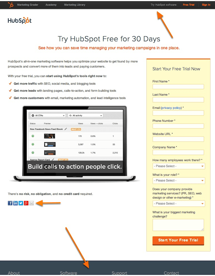
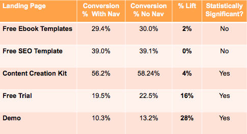
After performing the test they found that the variation without the links increased post-click landing page conversion rates:
Similarly, removing the navigation menu on Yuppiechef’s wedding registry page increased page signups by 100%.
What’s the moral of this story?
Only 16% of all post-click landing pages are free of navigation bars. That’s pretty scary when you consider all the negatives that come with navigation links. Your post-click landing page is a dedicated place for only one offer — your job as a savvy marketer is to allow the page to stay that way.
You’re not doing yourself any favors by including navigation links on your pages. At Instapage, we believe every promotion deserves its own page.
Always connect all your ads to personalized post-click landing pages to lower your cost per customer acquisition. Start creating your dedicated post-click pages by signing up for an Instapage Enterprise demo today.

See the Instapage Enterprise Plan in Action.
Demo includes AdMap™, Personalization, AMP,
Global Blocks, heatmaps & more.
