What is a Sales Page?
by Fahad Muhammad
A sales page is a standalone page created with one specific purpose in mind, to secure sales for your product. The product or service you’re selling on your page can differ depending on your industry or niche. However, the purpose of your sales page remains constant – getting visitors to convert into customers.
Sales pages are another type of post-click landing page that is divided into two main types:
Both types of sales pages are designed very similar. They contain a pitch of your product that your visitors go through and decide whether they want to click the call-to-action (CTA) or not.
The only difference between a long and a short sales page is the actual length of the page.
Here’s an example of a short-form sales page promoting Ramit Sethi’s “Find Your Dream Job” guide:
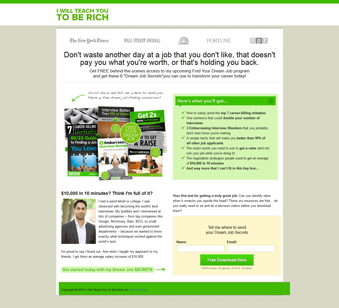
The page has:
A short-form sales page is like a typical post-click landing page and should include the same page elements. To find out more about post-click landing pages and how to optimize them, go here.
A long-form sales page is precisely what its name suggests — a lengthy page that explains what the product is in as much detail as necessary. It is also commonly referred to as a “sales letter.” The page relays all the information about the offer so the visitor can make an informed decision.
While a long-form sales page includes all the elements of a short-form sales page (i.e. a headline, form, CTA button and image), the “hero” of the page is the copy because that’s what really matters. The amount of copy makes the long-form sales page long, which is why the copy should get the most attention.
Most long-form sales pages aren’t received well by audiences and listed below are four main reasons why:
The Pythagorean Plan page is an excellent example of a sales page gone wrong. The overall tone of the page is a bit off, and the “Dear Friend” greeting comes across very fake:
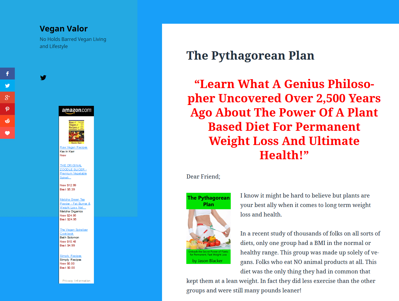
There’s only one graphic on the page, and the scattered red font draws emphasis to various parts of the sales pitch. But, this just makes the page design look scammy.
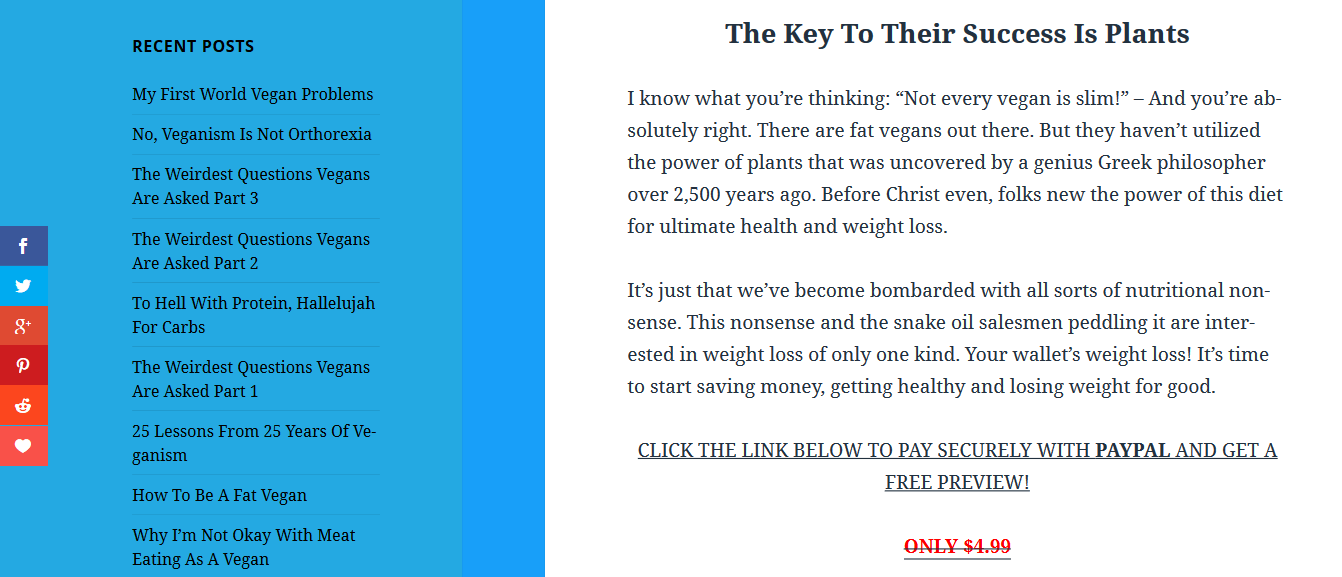
The Amazon ad on the left-side of the page is also a big distraction and detracts from any value the page has. The page also has a myriad of navigation links on the left hand margin, which gives visitors plenty of opportunities to navigate away from the page:
However, this list of reasons shouldn’t dissuade you from creating sales pages, because long-form sales pages are successful in generating leads and sales. Noah Kagan’s AppSumo long-form sales page is proof of that:
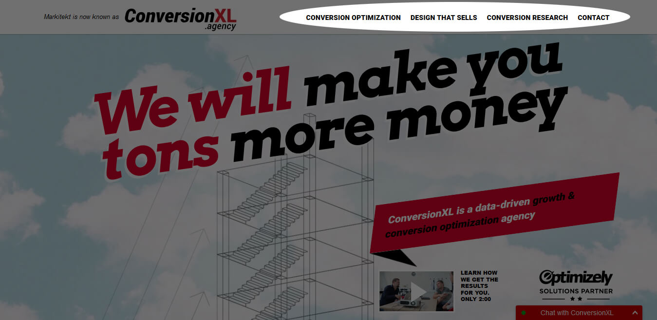
Creating an effective conversion-worthy long-form sales page is possible. All you need to do is include the right page elements. The CXL agency sales page is the perfect example of what a long-form sales page should look like:
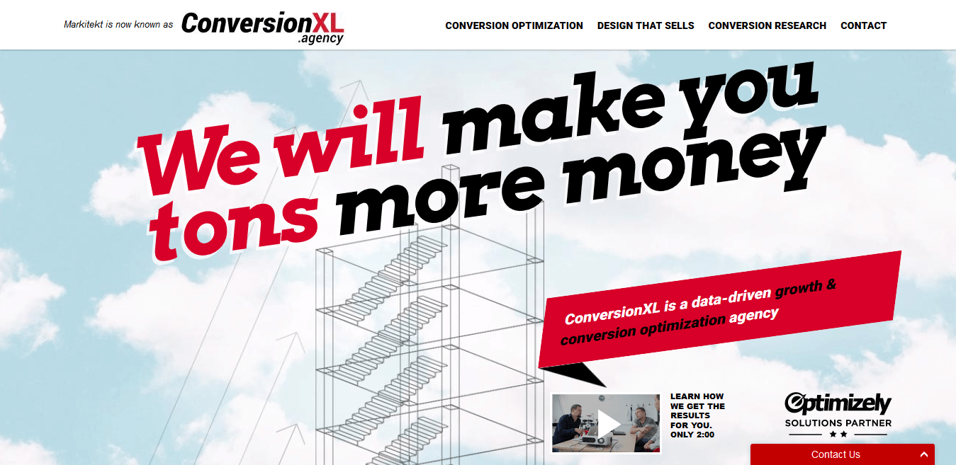
Above the fold, the page has a simple, to-the-point headline, customer badges, and a short 2-minute video you can watch.
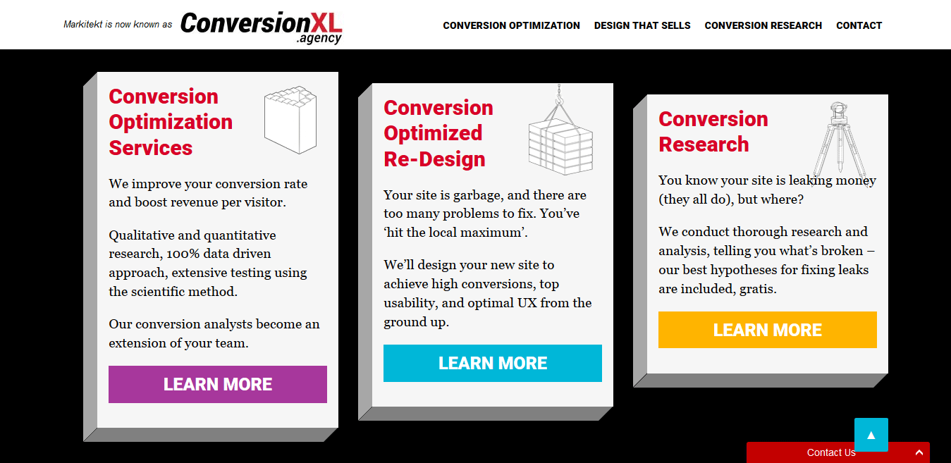
When you scroll below the fold you see the concise break-up of the services the agency offers:
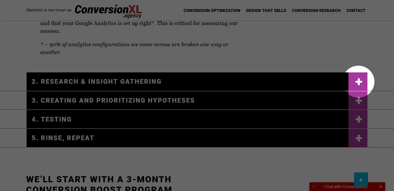
Further down, the copy and the images on the page explain what the agency does for you as the client. Some points are even designed in a hidden drop down menu, so only visitors who are interested in finding out about a certain point choose to view it.
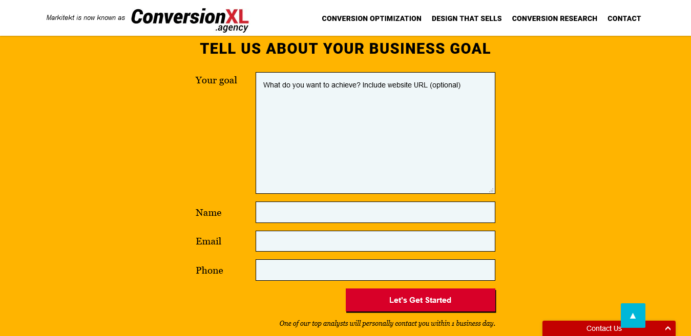
The page also has three strategically placed lead capture forms asking the visitor information at the right points:
Another useful element CXL uses is the “sticky” navigation links in the header that scroll with you as you move up and down the page. This feature makes it easy for you to navigate on the long page:
As you can see from CXL, a long-form sales page can work for your product if you know how to strike the right balance of copy and design elements on the page.
post-click landing pages and sales pages are the same thing because they are both standalone web pages that have one specific goal in mind. Both post-click landing pages and sales pages have the following elements:
However, long-form sales pages differ from typical post-click landing pages because the former tend to be quite lengthy when it comes to copy.
On the other hand, a homepage and a sales page are two completely different web pages. Your homepage discusses all the products and services your company has to offer while a sales page discusses just one offer and entices the visitor to sign-up for that single offer.
For example, this is the homepage for CXL:
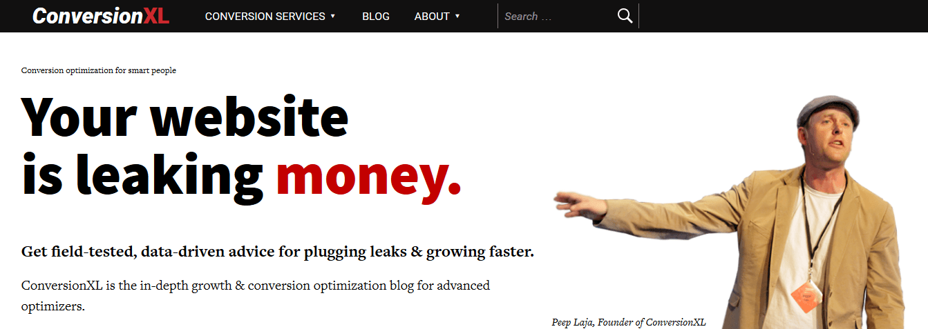
The page has all the services listed with navigation links that take visitors to the other pages on the website.
The homepage is shorter than the agency’s long-form sales page featured in chapter 1. But the latter discusses the offer in so much detail that it answers all of the questions a visitor may have.
Although a long sales page gets the job done, it is not always the best page design for your product or offer. Here are a few instances in which a long-form sales page works:
A sales page works best for your offer when the offer has a higher price tag and requires a high commitment from your prospect. That being said, a long-form sales page is not a good choice for offers like free trials.
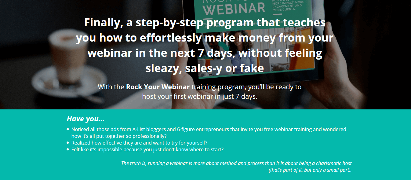
The Relentless Movement Webinar program is a perfect example of a product that needs a long-form sales page (P.S. This page was created with Instapage.):
Are you promoting a free trial for an offer your prospects already know about? Ditch the long-form sales page and go with shorter copy because when your visitors know your product well, they don’t need much copy to be convinced to sign up.
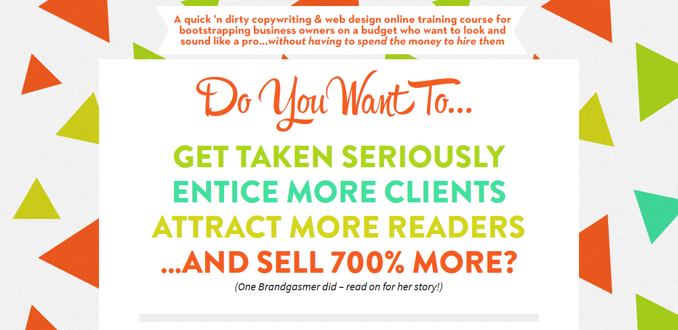
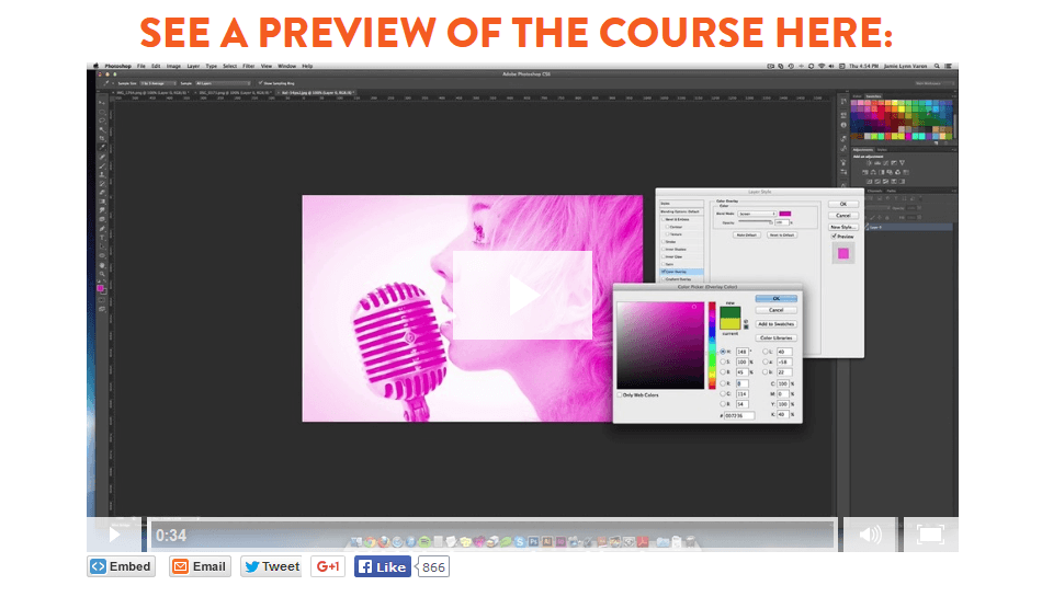
To see what you need to include on your long-form sales page (or sales letter) let’s look at Brandgasm 101’s sales page and break down the page elements.
Headline
The Brandgasm sales page has a longer headline than a typical landing page. Your sales letter headline needs to be a bit longer than a typical landing page because the sales letter is like a pitch and you need to really “hook” your visitors. This is achieved with an explanatory headline, which has the UVP (Unique Selling Proposition) to convince visitors to keep reading the page:
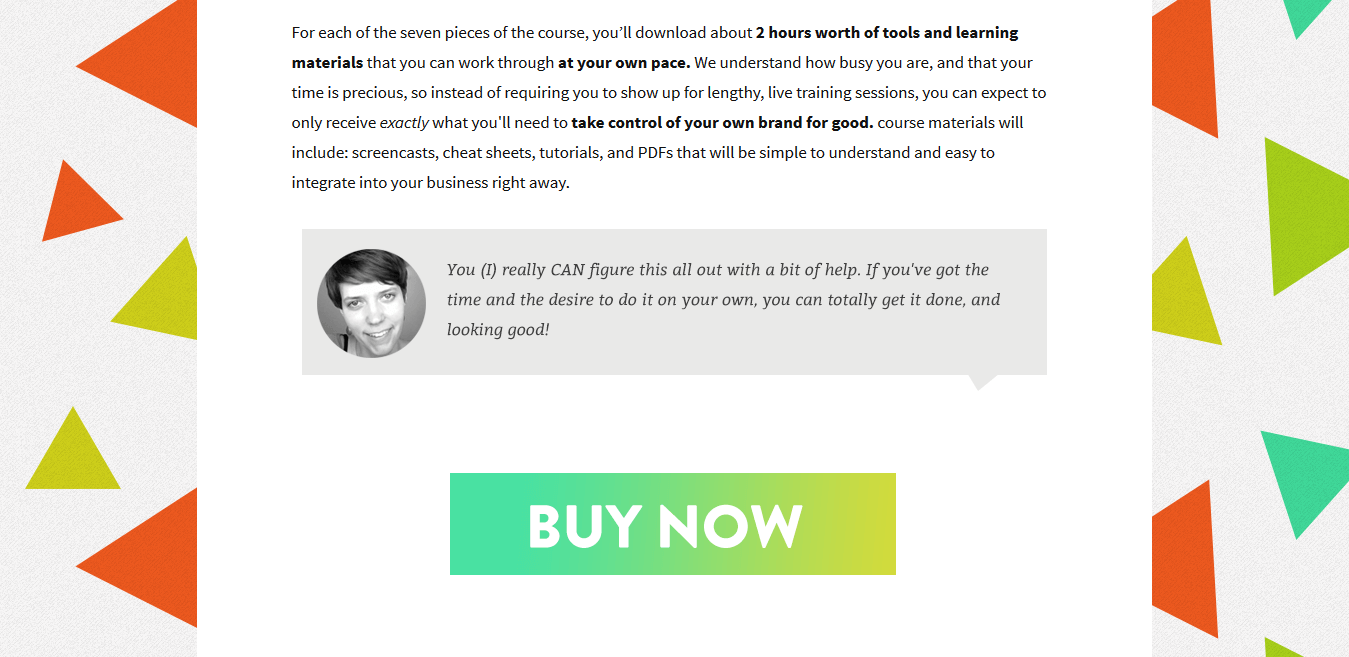
Copy
The copy is the hero of the long-form sales page, i.e. it is the element you need to focus on the most. If your copy is not on point, you might as well skip creating a sales page at all.
Because the sales page is lengthy, the copy needs to be broken down to enhance readability. It’s good to arrange your copy in short paragraphs and bullet points where necessary. It also works well when the copy is differentiated from other page elements (like Brandgasm 101 did with quotes in special boxes).
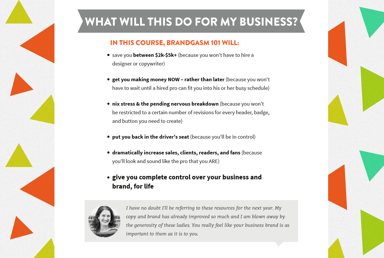
CTA Button
There should be multiple CTA buttons on your sales page. You can’t expect your visitors to scroll and find your main CTA button after they’re done reading everything on your page. This is why it’s a good idea to place multiple CTA buttons throughout the page. Visitors can just click the button where they feel the most convinced.
Your button needs to use a contrasting color and should have actionable copy on it. The Brandgasm 101 CTA button could be more contrasting, but what it’s really lacking is personalized copy.
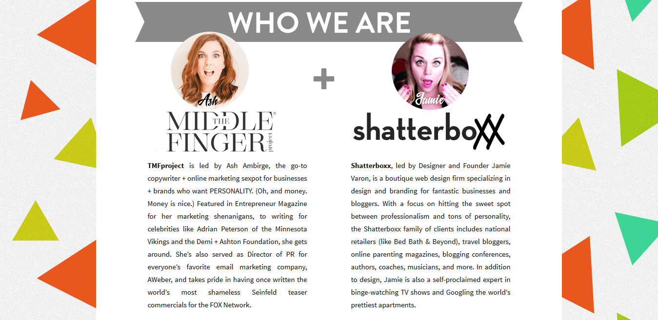
About Us
It’s good to have an “About Us” section on your sales page to boost credibility and make your offer more humanistic:
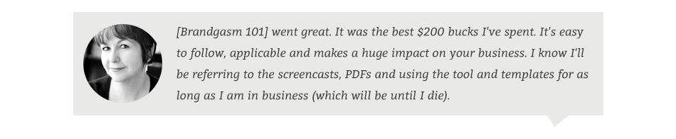
Testimonials
It’s also necessary to include testimonials of your past clients to assure your visitors the product they’re about to invest in has already proven useful to others. The same is true for customer badges and logos of companies where your product has been featured:
Video
Feature a video that helps explain what your product does:
Remove Navigation Links
Just like post-click landing pages, navigation links should be removed from sales pages. You spent so much time designing and writing copy for your long-form page, why would you provide options for visitors to leave?
You can create a long-form sales page no matter what industry you specialize in, just make sure the offer you’re promoting is worth creating a long-form page.
So, if your product:
Then it’s wise for you to create a sales page rather than a short-form post-click landing page because the sales page’s length is what convinces your visitors to buy what you’re offering.
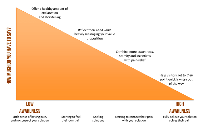
Joanna Wiebe from CopyHackers has the graphic below explaining how much copy your page needs depending on the awareness level of your product:
Are you selling a coaching program? Designing a long-form sales page may be your best choice because the sales page gives you the freedom to explain your product properly.
This is what Girls Gone Strong coaching program does with their sales page:
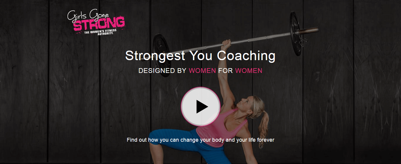
The page has a video, copy that explains the coaching program effectively, video testimonials, an FAQ section, an About Us section, photographs of women that appeal to the target audience, and multiple CTA buttons placed strategically on the page.
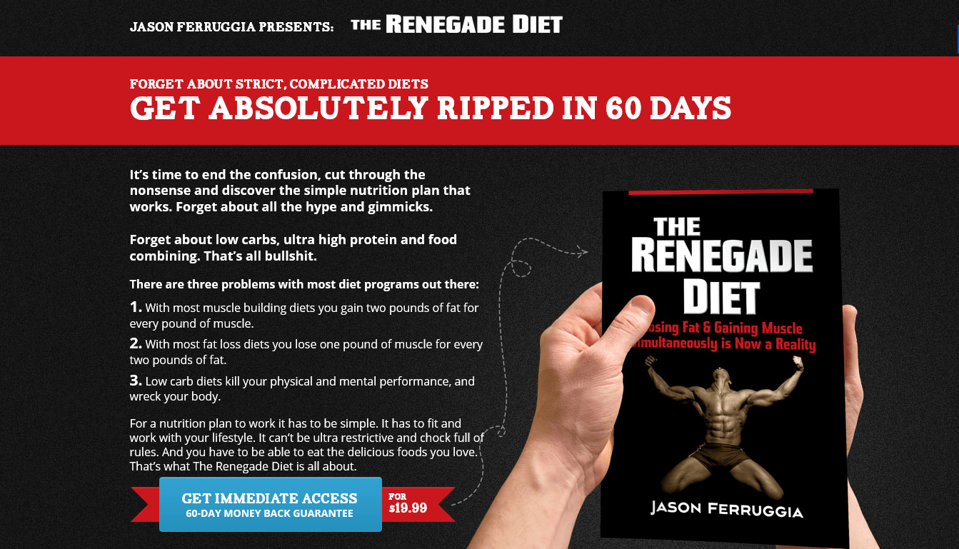
You can even promote your ebook with a sales page. Take a look at the Renegade Diet Book sales page here:
You can even promote your SaaS product with the help of a long-form sales page like AppSumo does with their long-form sales page.
It doesn’t matter what industry or niche you do business; a long-form sales page will work for your offer if it meets the prerequisites mentioned above.
How Do I Generate Traffic to My Sales Page?
Knowing what goes into a successful sales page is only half the conversion battle. For your sales pages to succeed, you need to know how to promote them.
For a sales page to convert, you have to be able to generate traffic to the page. When it comes to promoting your sales pages, you have two main options:
Learn more about promoting your sales pages using both paid and unpaid promotion techniques in this post-click landing page guide.
There are two main options when it comes to creating sales pages; you can either:
Instapage offers you the opportunity to create your post-click landing pages without any design or coding experience. Simply:
Creating a sales page becomes extremely when you follow these 5 elements of a winning sales page elements with the right software by your side — that’s what Instapage has to offer.
Edit and customize the template in the easy-to-use, designer-friendly builder and click “publish.”
A/B testing is the best way for you to increase your sales page conversions. With A/B testing, you create different variations of your page and see which variation performs better. This testing process gives you the “winning variation,” which can be shown to all visitors from that point forward.
The key to winning at A/B testing is to constantly be testing. However, remember to achieve statistical significance with each test, so your tests are accurate.
You can essentially test every element on your post-click landing page. The first thing you need to test on your sales page is the length — whether a short or long-form page would work better with your offer.
Page Length
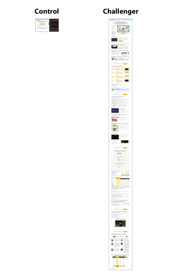
When Crazy Egg tested a long versus short page, the longer version grew revenue by 363%:
CTA Button Color
Also, test the color of your CTA button. Shopify shows an example where a red CTA button performed 34% better than a green button on a signup form:

Headline
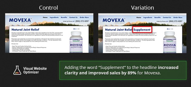
Another element you should be testing is the headline. Clarity always does wonders for your headline. For example, an A/B test by VWO on a clear post-click landing page headline increased conversions by 89%:
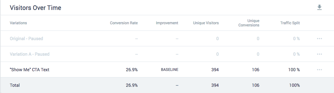
Performing A/B tests and interpreting the results becomes much easier with the right tool by your side. Instapage’s A/B testing tool can assist you here. With just a few clicks, you can add your variations and Instapage lets you track four primary metrics:
Sales pages give you the opportunity to pitch your products the right way in front of your visitors. With a long-form sales page, you have the chance to perfectly explain your offer, and with the right mix of graphics and copy, you can win more customers from your sales pages.
Create your sales page here with Instapage!
Try the world's most advanced landing page platform today.