What is a Landing Page?
by Fahad Muhammad

In marketing, a landing page is a page a visitor lands on after clicking through an email link, promotional link, or digital ads from Google, Bing, YouTube, and similar places on the web.
Contrary to homepages and other web pages, they showcase multiple offers and are created for a browsing experience. A landing page is a standalone page focused on one goal and disconnected from a website’s navigation. The page is created for the sole purpose of convincing a visitor to act—to sign up for a free trial, buy a product, download a whitepaper, or whatever else the campaign goal is.
This guide will tell you everything you need to know about landing pages, their anatomy, what makes them different from homepages, how to drive traffic to your pages, and examples of pages that are doing it right and achieving high conversion rates.
Let’s begin.
Contrary to homepages and other web pages, that showcase multiple offers and are created for a browsing experience. A landing page is a standalone page focused on one goal and disconnected from a website’s navigation.
The page is created for the sole purpose of convincing a visitor to act—to sign up for a free trial, buy a product, download a whitepaper, or whatever else the campaign goal is.
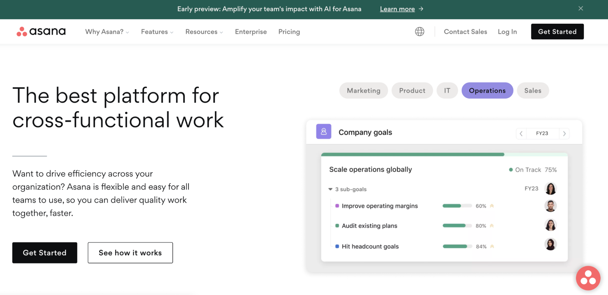
Let’s see this in action with some landing page examples. The Asana homepage offers visitors a chance to get to know all of their offers, solutions, and resources. The page is full of navigation links and multiple CTAs.
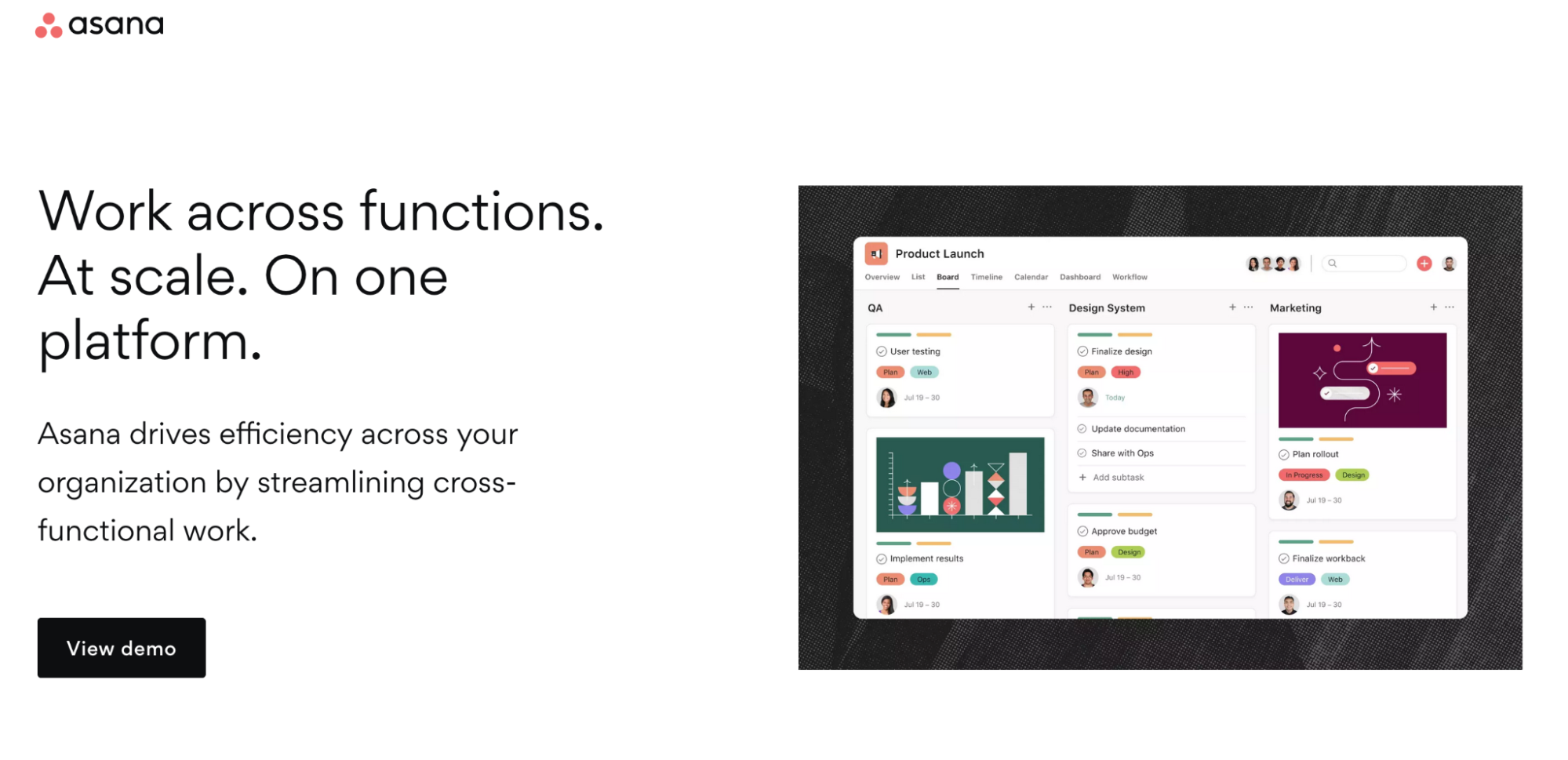
The Asana landing page, on the other hand, focuses on just one conversion goal—to get visitors to “view the demo.” There are no navigation links or competing offers on the page.
Just like a well-crafted masterpiece, a high-converting landing page has its own anatomy, meticulously designed to captivate, engage, and drive action.
In this section, we’ll delve deep into the art and science behind landing pages, dissecting every element to reveal the strategies and techniques that fuel their success.
Navigation links (or a navigation menu) is a map or a set of directions of a website that takes visitors deeper into the website experience. These links take visitors to different website pages, making it easier for them to navigate different website areas.
Every link on a navigation menu represents an individual conversion goal, and each one serves as an exit route or an excuse for the visitor to leave a page goal and arrive at another. This is precisely why landing pages are no place for including individual navigation links or, worse, an entire header and footer filled with navigation links.
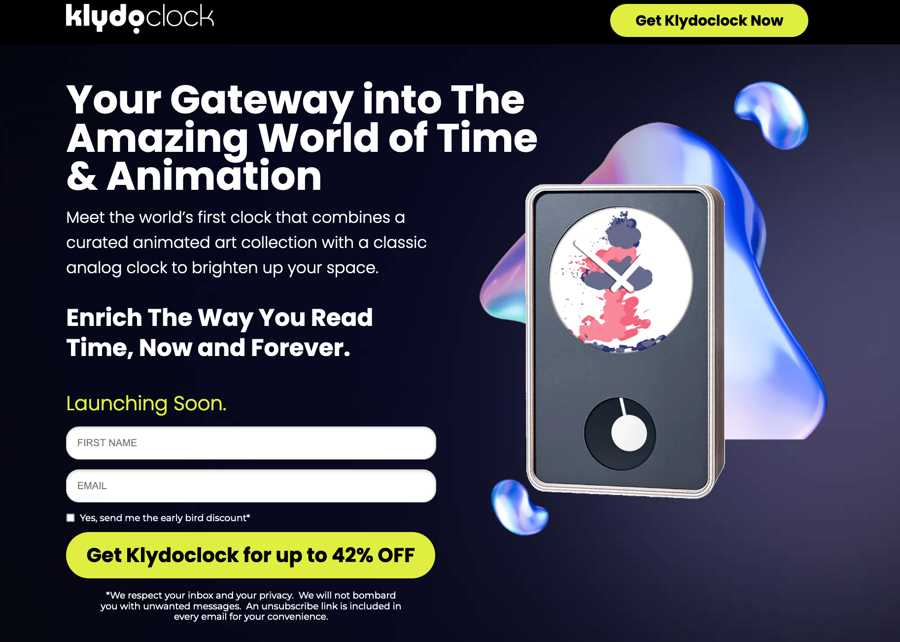
Keep your page focused on one conversion goal, as the Klydoclock page does—get the clock for 42% off.
When it comes to landing pages, the power of a captivating headline cannot be overstated. It serves as the first point of contact with your audience, enticing them to explore further and discover what your offer is all about.
Your headline should convey the primary benefit or your unique value proposition (UVP) succinctly, leaving no room for ambiguity. Avoid using clever wordplay or jargon that might confuse visitors. Instead, focus on addressing the specific pain points or desires of your target audience and how your product or service can provide a solution.
Depending on your target market and the nature of your offer, your headline can evoke emotions such as curiosity, joy, fear of missing out (FOMO), or a desire for self-improvement. Understand the emotional triggers that resonate with your audience and use them to craft compelling headlines.
The Vandham Spices headline highlights the service’s user benefits while helping visitors visualize what will happen once they click the CTA button.

The CTA button is where the action happens on your landing page.
A persuasive CTA button leaves no room for confusion on your landing page. Use clear and action-oriented language that explicitly states what action you want visitors to take. Instead of generic phrases like “Click here,” use more specific and enticing text such as “Get Started,” “Claim Your Free Trial,” or “Subscribe Now.” The more straightforward and compelling your CTA button’s copy, the more likely users will feel compelled to click.
When designing CTA buttons, utilize contrasting colors that complement your overall design scheme, making the button visually distinct from other elements. You also need to place your button in a strategic place—make sure it’s easily noticeable and accessible without the need to scroll excessively. Consider placing it above the fold to ensure it’s one of the first elements users see.
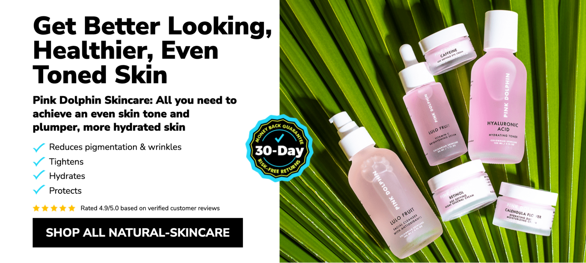
The Pink Dolphin Skincare landing page CTA button stands out on the page and tells the visitors exactly what they should expect after they click.
Where words fail to convey the value of an offer, visuals can excel. Studies have shown that it’s far easier for people to process images than text, which makes sense when you consider humans largely interpret the world around them without the help of words.
On your landing page, visuals like explainer videos can detail how your offer works and images can help your visitor imagine how your product or service changes their world for the better. A good product shot allows a visitor to see the ins and outs of your offer. If that offer is technical, this is an effective way to showcase its features.
When your product is new or complicated, explainer videos can detail exactly how it improves your customers’ lives. These short, routinely animated clips often take visitors through a PAS scenario that introduces a problem, agitates it, then presents your offer as the solution.
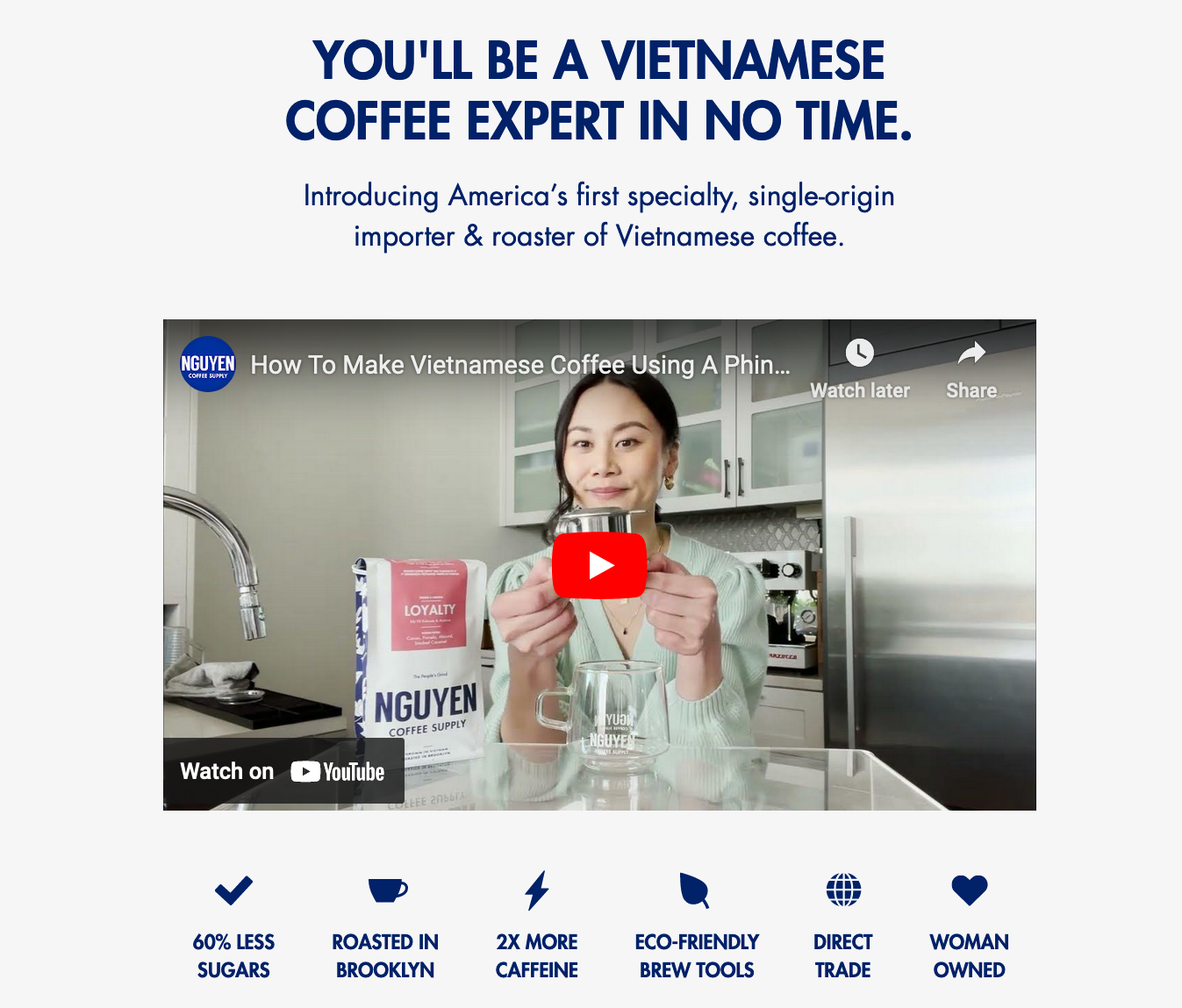
The Nguyen Coffee landing page video does exactly that.
Nearly every type of landing page features a form. And on all those landing pages, the form is commonly the biggest source of friction. It’s where you ask your visitors for their personal information—from name to credit card number, and everything in between.
It’s for that reason the landing page form has been a highly examined design element by many conversion optimization teams.
With every field you add to your form, you learn more about your prospects—but, there’s a tradeoff. Every field you add is an additional obstacle that stands in the way of what your visitor wants, so it is important to present your form fields in a single-column layout to keep from interrupting the downward momentum of the user, unless fields are related (like first name and last name or city, state, and zip code).
Also, remember to request prospect information in a logical order. Don’t ask for first name, then email address, then last name. Ask for first name, then last name, then email address.
No matter your conversion goal—whether it’s signups, downloads, sales, or anything else—to convince your visitors to claim your offer, you need to get them to trust you. With indicators like social proof, security badges, and more, it’s possible.
Each indicator communicates something different, so it’s important to know when and where it’ll have the maximum impact on your landing page.
Testimonials from real customers add authenticity to your landing page. When potential customers see positive feedback from others who have used and benefited from your product or service, it instills confidence in your brand and builds trust. This social proof can be a powerful factor in persuading hesitant visitors to take action.
Before submitting their personal information on a landing page, visitors will look for signs that indicate it’s secure. The “https” in your URL isn’t enough. You’ll also want to include clear and obvious signs, like badges from trusted security companies like Norton or McAfee, near your credit card field. A link to your privacy policy where prospects can find out how their personal information will be used.
Numbers are almost always more persuasive than words. Statistical proof of ROAS from real customers beats even the most positive testimonials because the old adage really is true: Numbers don’t lie.
To boost credibility, you can never go wrong by showcasing awards. Even if they’re from little-known organizations, these convey an outside party’s acknowledgment of your excellence in a particular field or on a certain campaign.
A landing page is like a puzzle. Having all the right pieces isn’t enough. Your elements need to come together to form a page that subtly guides your visitor toward conversion. Learn how to promote your landing pages with the right campaigns.
Every marketing campaign can benefit from the help of a targeted landing page, but it’s paid promotions that absolutely should not be run without one. When you’re spending valuable chunks of your budget to generate traffic, outbound links and lack of message match can translate to lost dollars. The following are campaign types that should not, under any circumstances, be run without a landing page…
If you use Google Ads or Bing Ads to drive traffic, your campaign won’t reach its potential without a landing page. Google has made it clear in its advertising guidelines that landing page experience has a giant impact on Quality Score.
Without a dedicated landing page relevant to your visitors’ search, your campaign will be penalized, which will result in lower ad visibility and, ultimately, less traffic to your website.
Paid social media advertising has gotten much more powerful in the last several years with the fine-tuning of pinpoint targeting (and retargeting) capabilities. But those targeting capabilities are wasted if you send traffic to a web page with general and scattered information (like a homepage or an “our services” or “products” page, for example).
Highly targeted ads need highly targeted landing pages with message match to generate maximum ROI. If you know enough about your users to reach them with laser-targeted advertising parameters, you know enough about them to deliver a
highly relevant landing page experience.
Those who click your ad do so because they’ve caught the scent of information that could help them solve a problem. That’s why it’s important you deliver exactly what you promised in your ad.
Email is still marketers’ most valuable channel, delivering $36 in ROI for every $1 spent. When combined with targeted landing pages, that revenue potential gets even higher.
When a subscriber clicks on an offer in an email and is taken to a landing page, they are focused on one task and one task alone. That increases the likelihood of a subscriber following through with the action.
What happens if there isn’t a specific landing page for an email offer? Most likely, the subscriber is taken to the homepage, or a product page and has to figure out how to take action.
Of course, your homepage is also full of a dozen other links, tabs, and images. All of these things can be distracting to this particular subscriber who just wants to follow through with the action outlined in the email.
That’s why email landing pages are so effective. They cut through the clutter. A subscriber is less likely to get sidetracked, or confused because he or she arrives on a page that focuses on the offer from the email and allows him or her to take action.
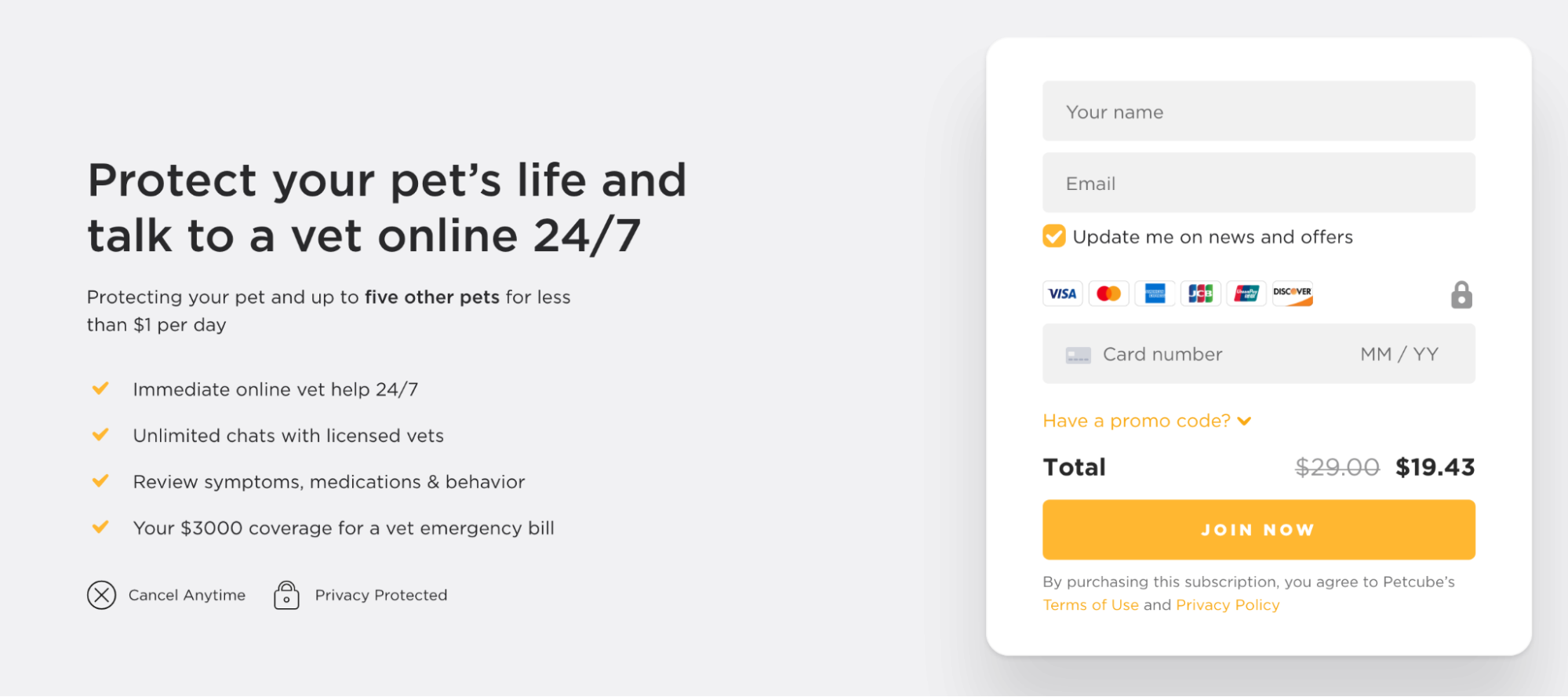
Petcube’s email landing page features its emergency fund offer. The email highlights the offer’s benefits and asks subscribers to start their free trial. The email landing page details why the Emergency Fund is worth trying for users.

Building a landing page is one thing, but building the right landing page is something else completely. The term “landing page” encompasses five different types of pages:
Which one you build will depend on your goal and where your prospect is in the buyer’s journey. A sales page used at the top of your funnel will fail to convert its visitors nearly 100% of the time, while a squeeze page in its place will see much more success. Learn how the five types of landing pages fit into your marketing funnel and when to use each:
The top of your marketing funnel is an unsure place for both you and your prospects. At that point, they’re not sure that you’re the right solution to their problem, and you’re not sure that they’re seriously interested in your product or service.
Squeeze pages are particularly valuable at the top of your funnel because they’re made solely to capture a prospect’s email address, which you can use to begin a lead-nurturing initiative.
Normally, prospects click through a paid advertisement with the expectation that they’ll be directed to a landing page on which they can evaluate your offer. That’s not the case with a splash page.
Instead, visitors land on a splash page after being redirected by you, the advertiser, for one of a few different purposes (which you’ll learn in a minute).
A few goals of a splash page might be:
Whatever the goal of your splash page, it needs the following to accomplish it:
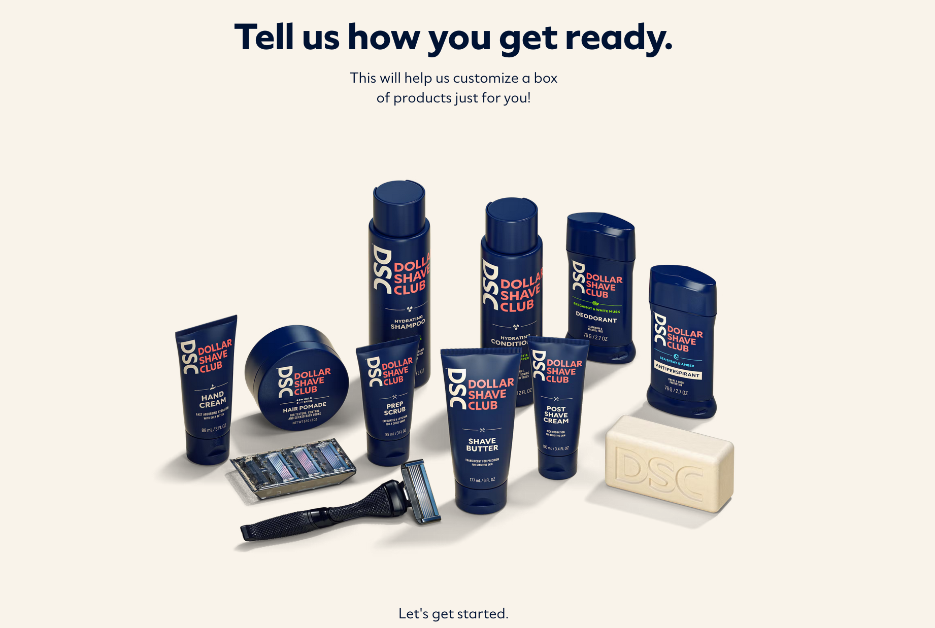
For example, the Dollar Dollar Shave Club splash page asks visitors to fill out a quick quiz to personalize products for them:
As long as it has a clearly defined purpose that adds value, a splash page can work throughout the funnel and beyond on both first-time prospects and recurring customers.
Lead capture landing pages are the most versatile and widely used of the five landing page types. These can be used at the top, middle, and bottom of your funnel. Their main distinguishing characteristic from other landing page types is their form, which every lead capture page needs to accomplish its goal: capture leads.
Generally, though, top-of-funnel lead capture landing pages ask for less information—strictly what your team needs to begin a lead nurturing initiative.
Remember: No matter where your leads are in the marketing funnel, they shouldn’t be frightened by the size of your form. Only request what is absolutely necessary. The fewer fields you feature, the less friction involved in converting, and the more likely visitors are to claim your offer.
Click-through landing pages are most valuable at the bottom of your funnel for warming up your leads to a particularly high-scrutiny offer. They can be used at all stages, but most often they pre-empt pages that feature the most friction-causing element known to marketers: the credit card form.
This landing page type allows visitors to read persuasive information about an offer without being distracted by the terrifying “buy” button. If and when they click through, they’re directed to a page where they can claim the offer via a form.
The Animoto click-through landing page showcases how visitors can create DIY professional videos with the platform and that they can get started for free.
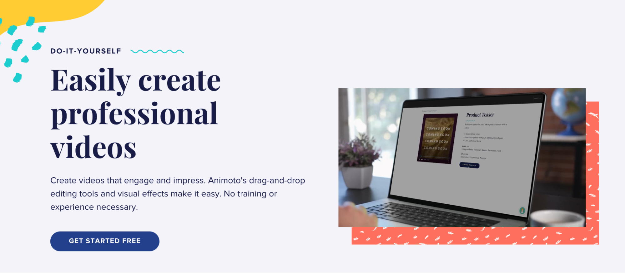
Landing pages that offer free ebooks or tip sheets can get away with skimping on testimonials or authority badges. However, when credit card information and, ultimately, money are on the line, your visitors will look for any reason to distrust you. It’s your job to make sure they can’t find one.
Of all landing page types, the sales page is the most difficult to get right; and that’s because it goes after the conversion that’s most valuable to marketers and most intimidating to visitors: the sale.
The primary goal is to drive conversions and generate sales for a particular product, service, or offer. Sales pages are an essential part of digital marketing and are commonly used in e-commerce, online courses, software sales, and other direct-response marketing campaigns.
The SomniFix sales page explains why mouth breathing is bad and how the “gentle mouth tape” helps you sleep better and promote nose breathing.
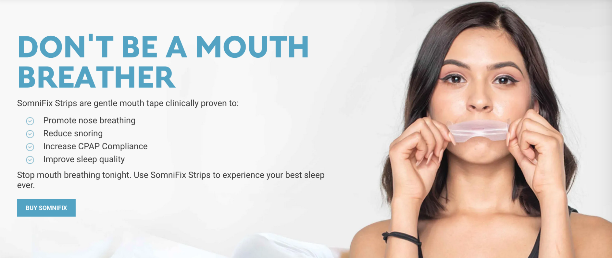
We’ve covered everything you need to know about landing pages—from how they differ from your homepages to the types of landing pages you can add to your campaigns. It’s now time to showcase how brands are doing right by their landing pages. All the elements on these landing pages are optimized for conversions.
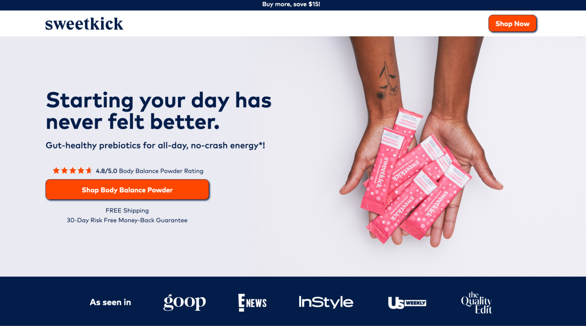
The Sweetkick landing page headline showcases the primary benefit users get from using the Sweetkick, “Starting your day has never felt better.” While the headline focuses on the product benefits, the sub-headline introduces visitors to what the product does. The page also includes plenty of trust indicators—customer testimonials, user reviews, a list of publications, and user videos.
The free shipping and 30-day risk free money-back guarantee also persuades visitors to click the personalized and contrasting CTA button.
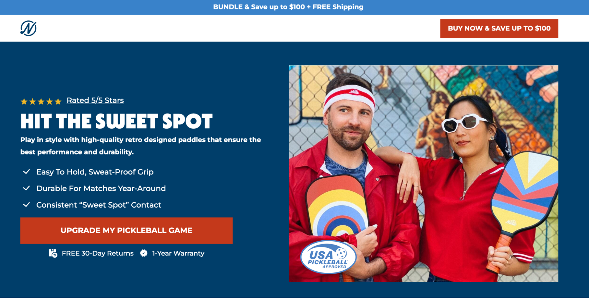
The Nettie landing page also includes all the elements that make a high-converting landing page. A fun headline that sets the stage for the Nettie retro-designed paddles. All the page elements revolve around the retro fun theme—from the headline to the images. The page also includes the founder’s story that showcases just how much passion has gone into creating the paddles.
The comparison chart between Nettie paddles and competitors help visitors see why they should choose the paddles to experience all the PickleBall fun.
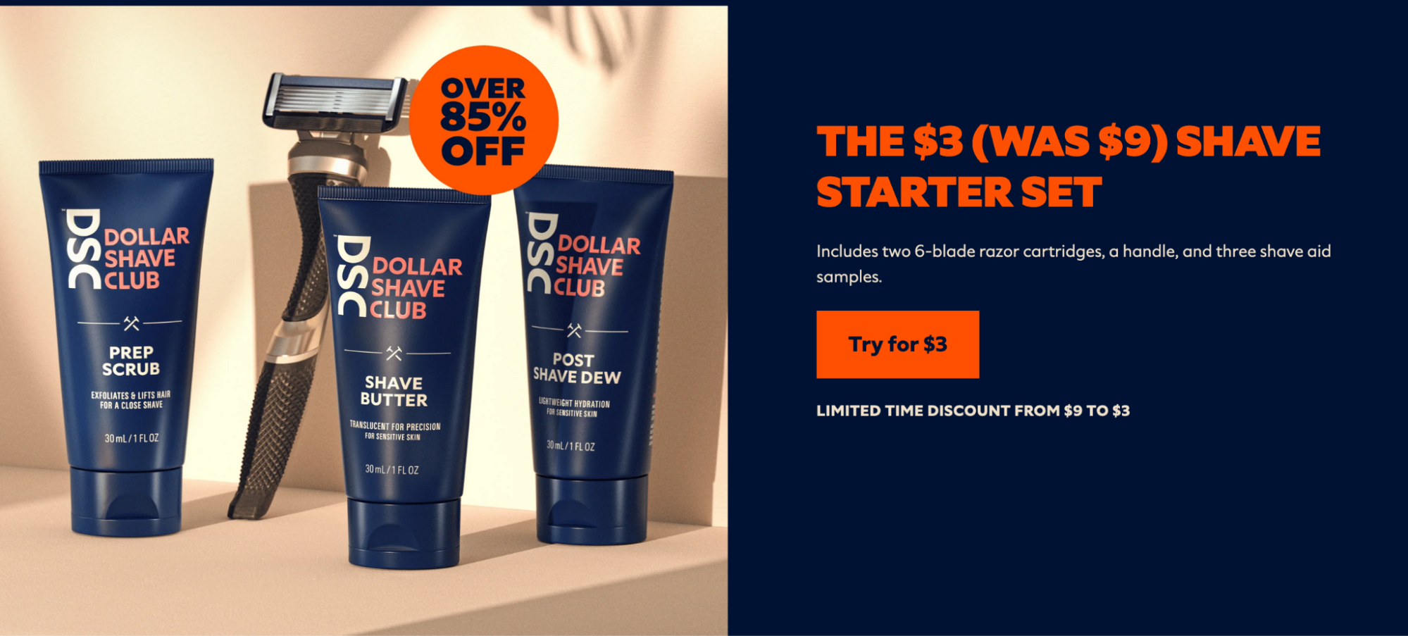
The Dollar Shave Club page is minimal and gets straight to the point. It tells users what the offer is, the discount they’re getting, and a bright CTA button that gets them the 85% off discount.
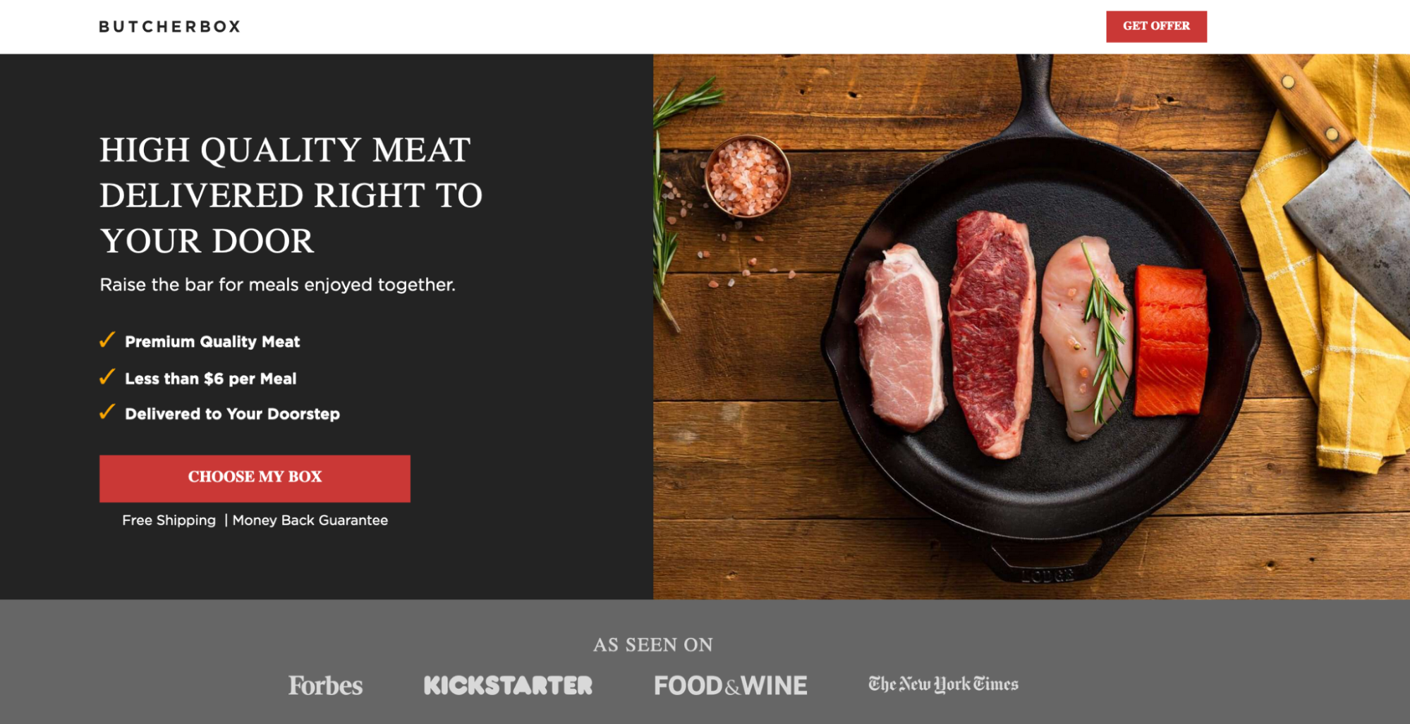
The ButcherBox page headline describes the service’s UVP—high-quality meat delivered straight to your door. The hero shot shows pieces of scrumptious proteins and the above-the-fold copy gives visitors ample reasons to click the CTA button.
Use these examples as inspiration for your next landing page campaign.
Putting all your newfound knowledge to work can be a hassle. Creating a landing page from scratch isn’t easy. There are wireframes to be built and coding to be done, and the process can routinely drag out for days at a time. There is a way, though, to shorten that process to a matter of minutes.
With Instapage, you can pick from over 500+ fully customizable templates by industry and use cases. We analyzed billions of conversions to build the world’s most advanced conversion design system.
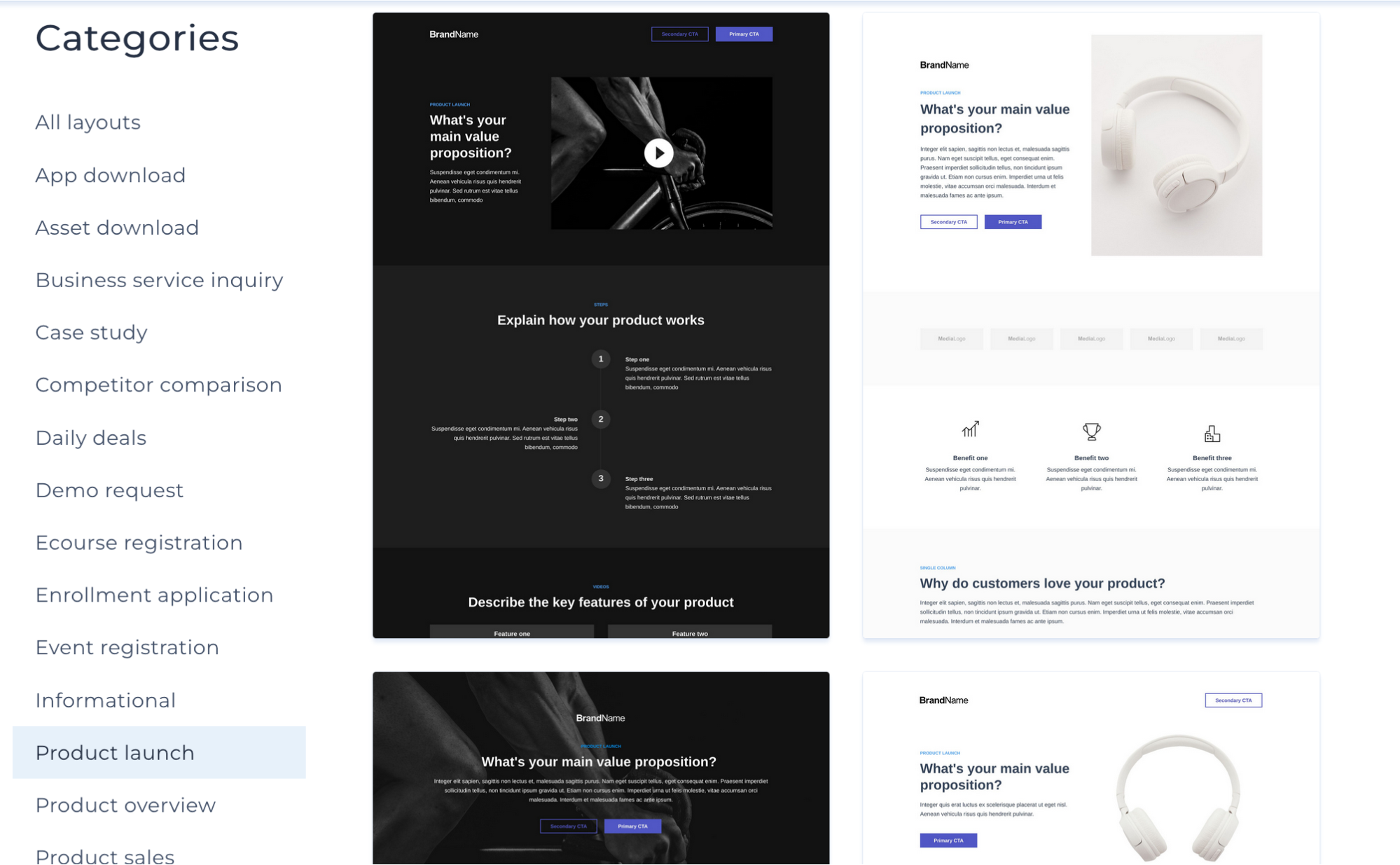
You can also quickly scale multiple landing pages with Instablocks® + Global Blocks that you can save, reuse, and update globally.
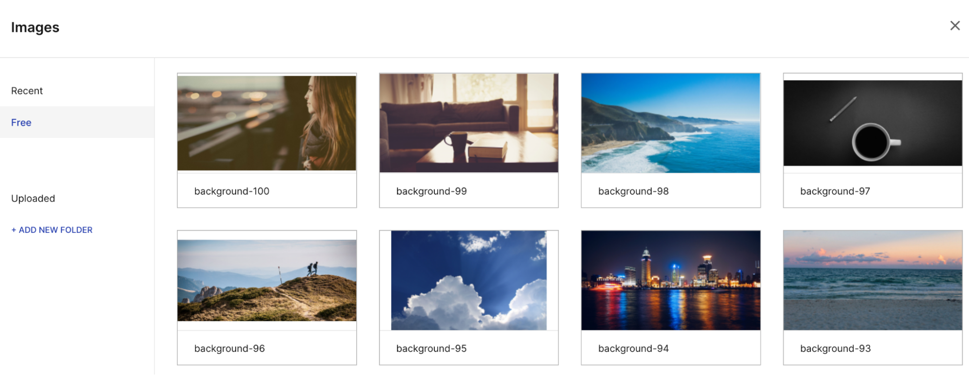
Use the intuitive drag-and-drop builder to create impactful landing pages. You can add new elements to those templates by dragging and dropping from the top menu bar:
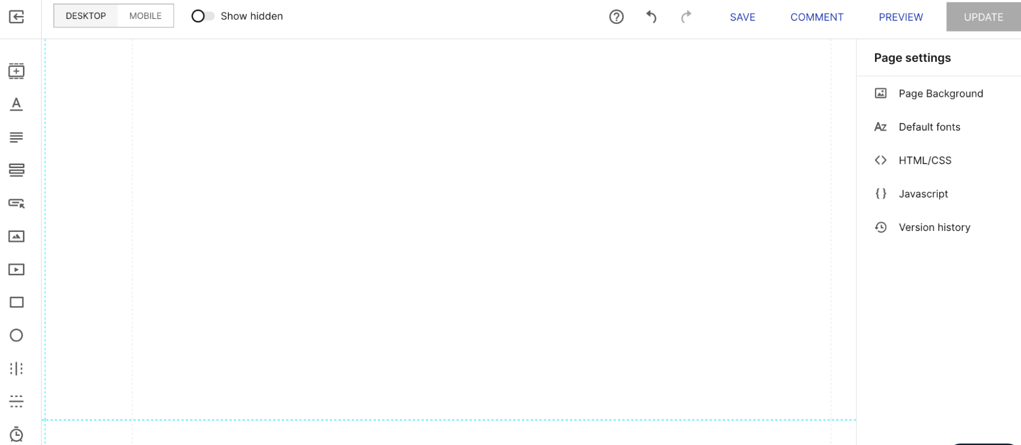
You can also Instantly generate content for each audience and ad group with AI-made headlines, paragraphs, and CTAs. Access AI Content Creation directly in the Instapage builder without interrupting your workflow.
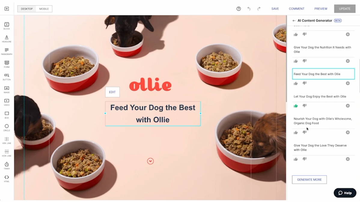
You can click to fine-tune any element or section of your page to keep the design 100% on-brand, right down to the style of your typeface with pixel-precision design features and a library of global brand assets to ensure that your pages are always on-brand.
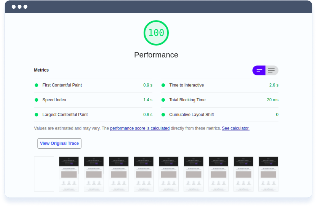
Deliver an unparalleled mobile experience with built-in AMP support. Plus, get the fastest landing page load speeds in the industry with our proprietary Thor Render Engine technology.
Integrate your page with 120+ of today’s most-used third-party advertising, analytics, CRM, email marketing, and marketing automation platforms.
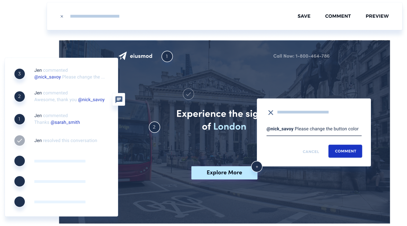
With Instapage, you can even build pages together to simplify your team’s workflow by using the Collaboration tool. Easily share your landing pages with stakeholders and clients to get their feedback, while ensuring pages are never seen by an unauthorized user.
Eliminate frustrating and unnecessary revisions by ensuring everyone is working on the latest page versions using real-time edits and Efficiently consolidate feedback in one place so stakeholders know the status of requests and can weigh in if needed.
When you’re done, you can preview your design on both desktop and mobile, then easily publish to a custom domain, CMS, Facebook, or our demo server.
See why we’re the choice of brands like HelloFresh, honey, Gartner, and Vimeo. Start converting more ad clicks into customers with all the intuitive experimentation, optimization, reporting, and growth tools you need—all in one place.
Sign up for an Instapage 14-day trial and see the impact a powerful landing page platform can have on your campaigns.
Try the world's most advanced landing page platform today.